|
Finally, exams are finished! I completed my final two, which were make-ups from when I missed school (the covid chronicles). Although they took up a portion of my week, I still got some classroom days to work. Mostly I spent time gathering various textures for where needed, however I also made this Row 3 logo to be used in the game. 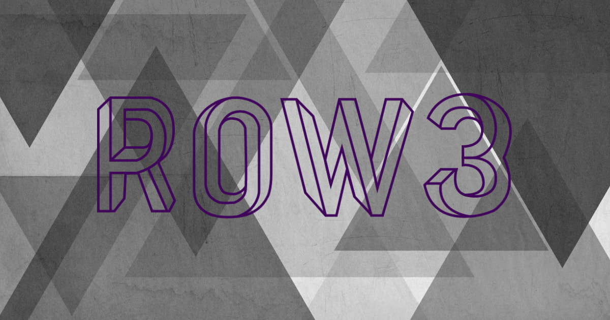
We’re pretty much in the final stretches and this will be the last check-in of the year. Aside from this weekend, time to work has come to a close. Ultimately I think we accomplished the necessities and bare minimum, but came to realize how grand of a scope Mountainheart was in the first place. We’re certainly turning in an abridged version of the original concept and gameplay, and it is not as polished as we may have hoped. Between covid and exam interruptions, we haven’t had much face to face time these last few weeks which has made this more difficult; there also hasn’t been much communication outside of class. Regardless, I think we accomplished enough to call it a working game, and even more important is that we have learned a lot throughout development. Summary:
0 Comments
This last week for me has been focused on AP testing. Wednesday, this week, will mark the end of my exams. I hope to get further on track after that, but for the time being I am focused wholeheartedly on using my time in preparation. As for this class, I worked on grabbing some inspiration. I want to create a mascot for Cliffside that will add to its vibe.
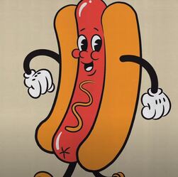
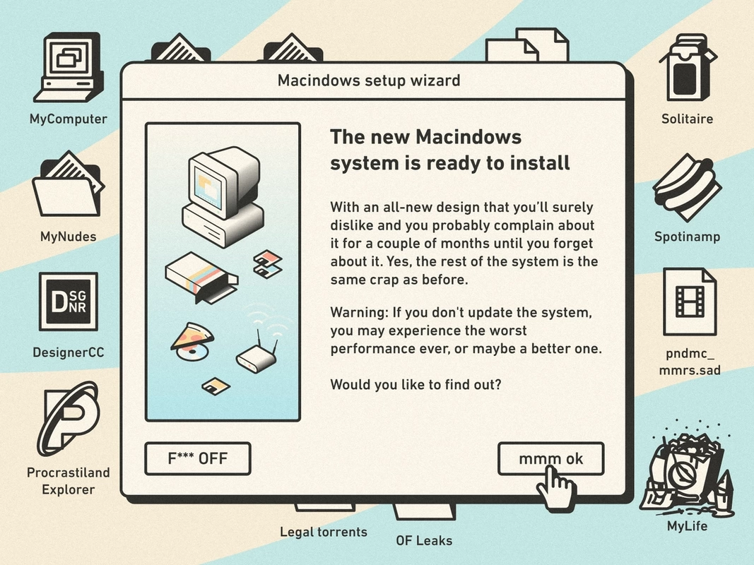
I like how the hotdog man stands out and I think the cartoony aspect juxtaposes nicely with the dilapidated horror of the Cliffside facility. I could make something similar, such as a crystal or a cloud that would go with the Cliffside logo. On the right is a Macindows UI I saw on Dribbble. I really like the humor in it, though some may be a bit much. However, it feels very alive and confrontational, as if the system has a mind of its own. I also like the design itself. I can use these images for inspiration during this coming week. TLDR:
Overall, I have enjoyed this year of Game Design. I appreciate the independence and leadership positions we have been given; although it would be nice to have a little bit more incentive here and there. I have enjoyed getting to work with and rely on other people, albeit some people make that a bit more difficult. It is super fun getting to come up with ideas an then work with others to actually bring them to life, and to have other’s bring their own ideas to the table. It can be like trading gifts or playing White Elephant; there is an excitement in having multiple sources of creativity and creation itself. I do, however, wish we had the entire year to make our games. The development process being squashed/crammed into a small period and with all the wrenches that have been thrown in the path, has made it difficult to truly put in the ideal time and standard to our projects, to a point where’s its demotivating. It seems like a fools errand almost, or like BS’ing our way through just to get something on its feet. Striving for “good enough” feels closer to a waste of time than a productive and proud effort. We may continue working over summer, but I doubt it. Right now we are in crunch time and it has been hard to organize when only two members are available at a time. I don’t see it coming to fruition in time, but hopefully it works out. I will do my part, I have to hope everyone else doesn’t drop off the face of the earth when exams are finished. Overall it has been both a fun and hectic experience, and one I am happy I was there for. Summation:
Sadness as an era ends. This class has been a staple of my time at DSA, a consolation of familiar + friendly faces amidst the craziness that has come and gone too frequently. Im sad that this may be the last portfolio check that I have to do, and that these coming weeks are the end of something that has given me consistent comfort throughout my entire high-school experience. I feel sadness not just as this year ends, but also as the the last four years come to an end. Overall, the summation of my experience is one of continued development; not just the development of games, but of myself as I have grown during my time at DSA and in the game design classroom. It feels short lived, but it has been ongoing and omnipresent. This class, and the subsequent school-years built around it, will encompass a huge period of character growth and future nostalgia that will always be prevalent in my life. I will always look back with happy memories. And a tinge of sadness. Debriefing:
I was out the entirety of the week with covid and with AP exams rolling by, I have been bogged down on two different fronts. I haven’t found a significant amount of time to set aside for this class or to prioritize our game, especially since it seems like it may not come to fruition in time. In the time I did work, I continued with what I had been working on before; graphics and UI adjustments.  I ran into some roadblocks with using Procreate to lay out pieces of the UI and may instead convert to Photoshop. Photoshop is more precise with placements and is better for this type of work such as positioning pieces. I need to work on my time management and hopefully having class time can help boost my contributions. Overall, the game is coming along but it may not be on its feet in time. There was a covid outbreak following prom at school, and AP exams are popping up. It’s crunch time. As you may know, I missed most of the week, feeling ill. Unfortunately it came back positive for Covid-19 and I am still quarantined here in my room, bedridden. I accomplished some work from home and in my meager 2 days in class, but it isn’t a lot to show. I know this is crunch time and hopefully I can finish up my contributions between exams, however these weeks will be packed full of cramming for all sorts of things, so I am unsure how much time I will have. I hope that my team can continue making progress and we can at least get this project standing on its feet. 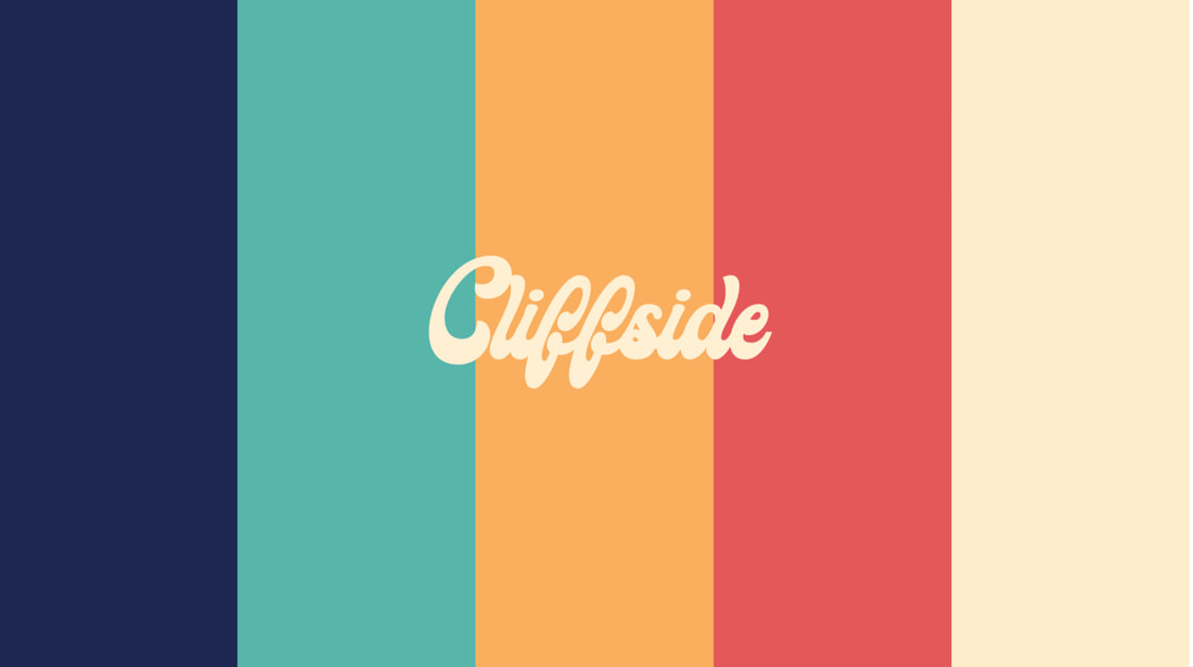 All-in-all:
This week I spent my time on the aesthetic of the UI. Before that I had pretty much mapped out the overall look and design, but now I have been working in Photoshop to actually make it more usable and to refine the edges so that it carries the nostalgia of an old 1990s PC.  I think I could improve my efficiency, and spend more time away from class working, however I had a busy week between preparing for tests and the States competition for Science Olympiad. This week I hope to finish everything around the UI and to work at home as well since I finally should have more free time. I like the results of how its coming along, but I really need to get a move on and hurry. Conclusion:
Between missing school and having Friday off as a holiday, I was only at school one day this week. I didn’t have much time to accomplish work in the classroom but I was able to work from home a bit when I was feeling better. I continued with the UI that I had begun earlier. 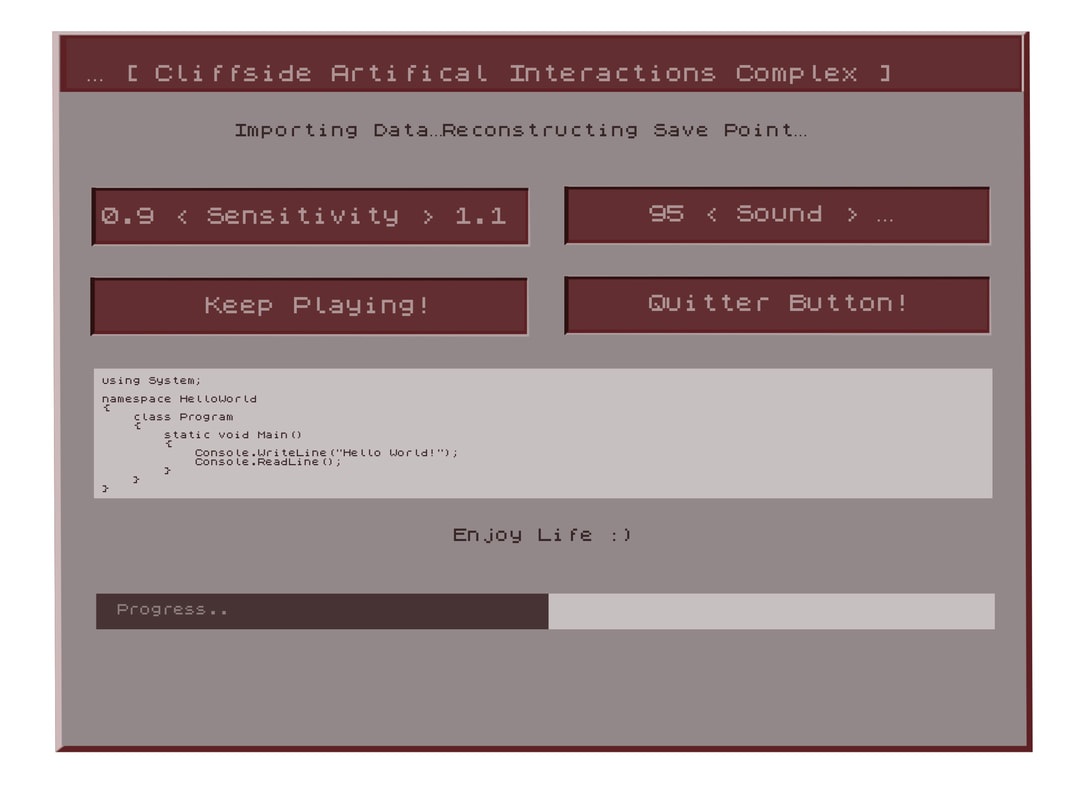 I’m happy with where it’s at. I still need to figure out how to make it pop a bit more and give some depth along the edges. Otherwise, I like the general aesthetic. I can’t say much about how the team has been progressing besides that everyone is doing their part. The only setback for me was not feeling well and being at school only one day. Next week I hope to utilize class time to get back on track and finish this UI once and for all. TLDR:
This last week was spent working on the Cliffside logo in class, as well as the UI at home. The logo was inspired by a retro wave style theme and a font called ‘groovy.’ I was searching for inspiration that encapsulated the way I envisioned the 60s aesthetic and vibe. I downloaded a free font similar to what I liked and then watched a tutorial for text layering in order to create the intended effect (type shift). I think it turned out well but was way more difficult and time-consuming than it should have been for something so simple, and felt very unintuitive which is again why I hate Photoshop. For a program with an overload of tools, the features aren’t ever there when you need them. Although it’s a simple text effect, I think having a logo and building the vibe sets an important tone for the entire game. I like the juxtaposition between the look of Cliffside’s logo and the actual environment inside the abandoned facility. It’s eerily welcoming. 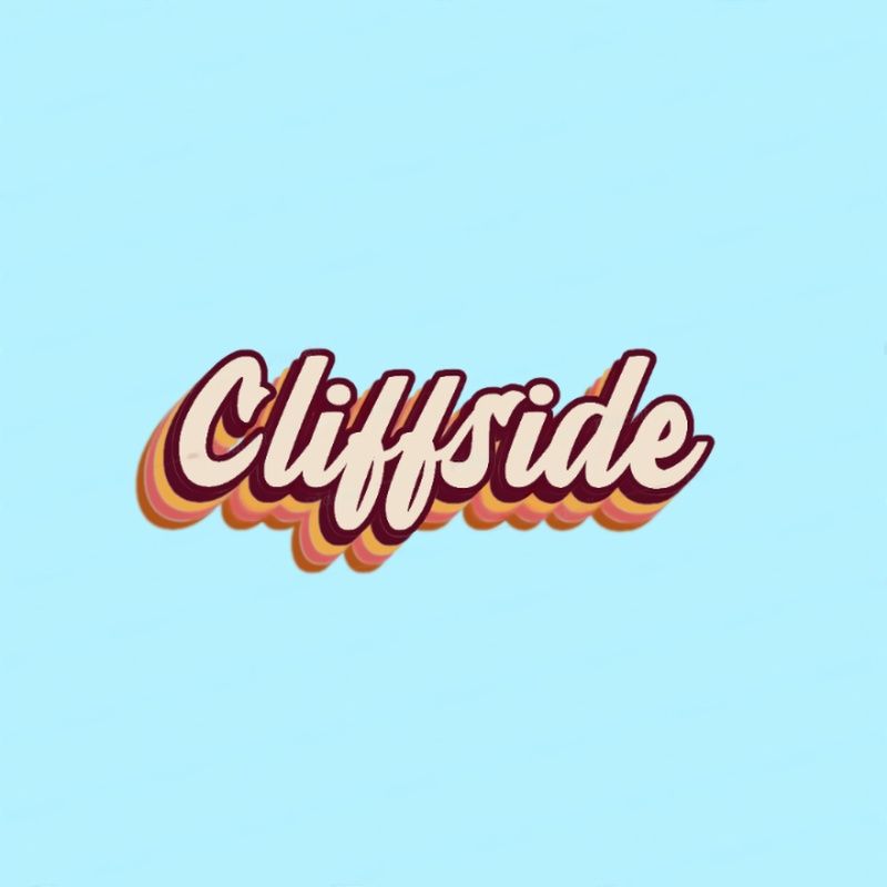 My group has also made a good deal of progress with the UI functionality and audio effects. It’s nice to see it all come together. I also came up with and brainstormed a few ideas on how we could add some stylism and humor that conveys the game’s personality; when trying to quit, the game the screen will pop up with the usual “are you sure you want to quit?” followed by a spam entry of “are you absolutely, positively sure you want to quit?” like a cascade of pop-up ads or viruses on an old computer OS. I think this is a prime example of the Mountainheart game “feel” we are going for. Coming up with and adding creative features like this has helped build some morale and hype for our game. Everyone seems to be on the same page and way more unified, though we still aren’t as far as we need to be. This upcoming week will be focused on finishing the UI completely and all of the aesthetic aspects. I will do the finishing touches on the logo, and continue with the UI which will hopefully be done by the end of the week. Recap:
As the lead 2D Artist for my team, I am currently working on the UI that the player will interact with by the endgame of our development. I wasn’t given a reference for the intended design, so I decided to go based upon my own feel of the game. Mountainheart takes place in an older facility, which led me to the idea of doing something diegetic and fitting with both the time and theme, which brought me to my inspiration: the World Wide Web (the original internet browser) UI, and subsequently the original Microsoft operating system as well. Cliffside is a research facility so it should be sort of tech-y. And it’s oddly advanced for the time period. It is also a horror game so I didn’t want it to pop too much, to where it stands out from the rest of what’s going on. Rather than copy the blue, white, and grey of the Microsoft classic theme, I decided to stick with muted colors that share the same red undertones. This is because Mountainheart, naturally, strikes me that way and it felt right given the name. Mountain + Heart; beige and red. It also does not distract from the game’s horror elements, rather adding to the immersion. 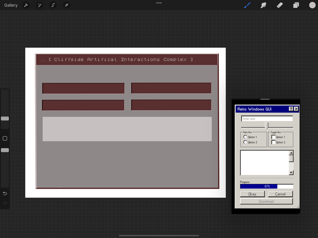 I imported a pixelated font to convey the older operating system and UI, and have been working down to the pixel to add onto that effect elsewhere in the design. It has been a struggle making it look pixelated and low resolution, like an older computer screen, but also clean and friendly to users. I still have features to add and right now its mostly the bare layout; highlights will help it standout, and more buttons will add functionality and fill in the blank space, which I can add after I consult with my team. Right now it is a bit flat and stiff. I need to add the finishing touches and then draw in some dimension, like I said. Overall I think our team has really gotten on track, and I am happy I have had more time to focus on 2D artist things. I would also like to do 3D models in the future, but first the UI is my priority. The settings menu will probably take this week to finish and I may be able to get a jumpstart on the cassette inventory from there, hopefully utilizing some of what I have already made. I have made sure to work with layers so that the design is modular, customizable, and correctable. I look forward to finishing this and am really excited to see how the UI works in game. On the need to know:
|
AuthorMy name is Quinn Peterson! I will be reflecting about my art work in this blog! Archives
May 2022
Categories
All
|
 RSS Feed
