|
As the lead 2D Artist for my team, I am currently working on the UI that the player will interact with by the endgame of our development. I wasn’t given a reference for the intended design, so I decided to go based upon my own feel of the game. Mountainheart takes place in an older facility, which led me to the idea of doing something diegetic and fitting with both the time and theme, which brought me to my inspiration: the World Wide Web (the original internet browser) UI, and subsequently the original Microsoft operating system as well. Cliffside is a research facility so it should be sort of tech-y. And it’s oddly advanced for the time period. It is also a horror game so I didn’t want it to pop too much, to where it stands out from the rest of what’s going on. Rather than copy the blue, white, and grey of the Microsoft classic theme, I decided to stick with muted colors that share the same red undertones. This is because Mountainheart, naturally, strikes me that way and it felt right given the name. Mountain + Heart; beige and red. It also does not distract from the game’s horror elements, rather adding to the immersion. 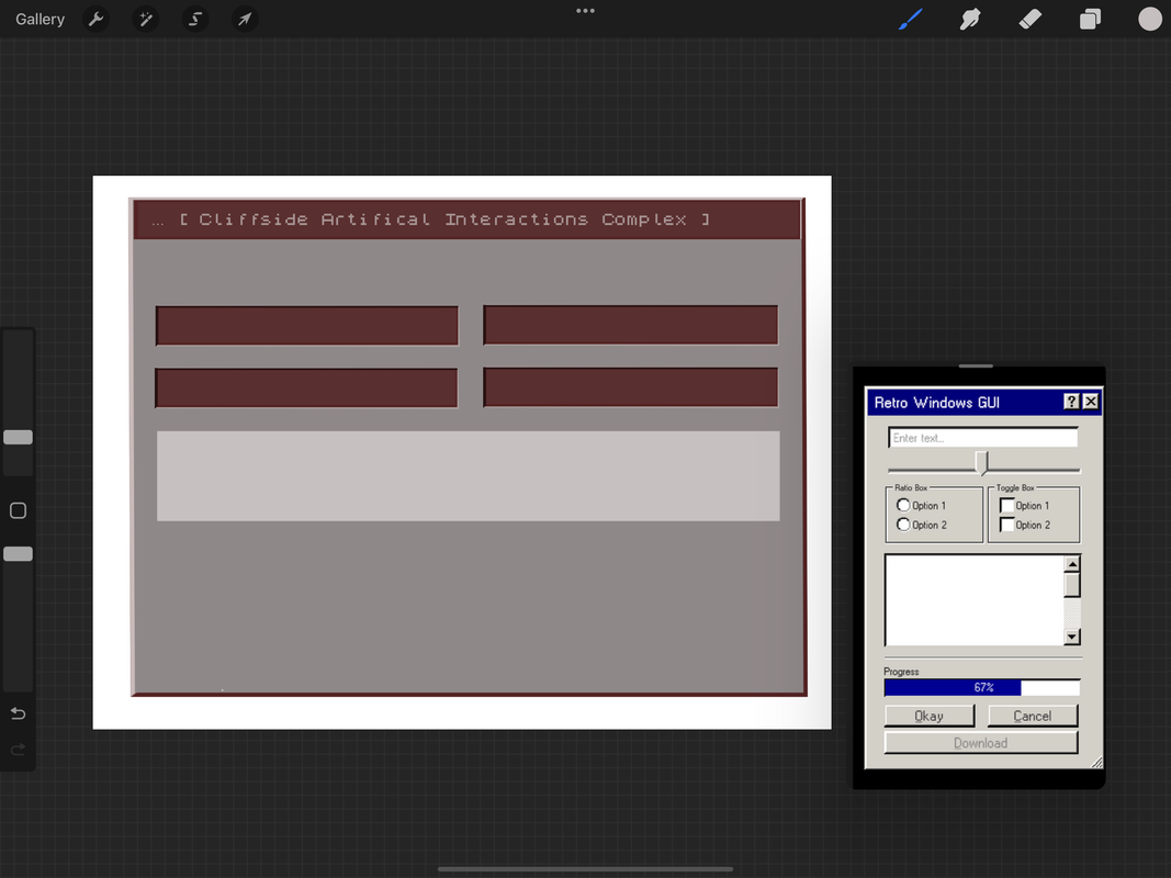 I imported a pixelated font to convey the older operating system and UI, and have been working down to the pixel to add onto that effect elsewhere in the design. It has been a struggle making it look pixelated and low resolution, like an older computer screen, but also clean and friendly to users. I still have features to add and right now its mostly the bare layout; highlights will help it standout, and more buttons will add functionality and fill in the blank space, which I can add after I consult with my team. Right now it is a bit flat and stiff. I need to add the finishing touches and then draw in some dimension, like I said. Overall I think our team has really gotten on track, and I am happy I have had more time to focus on 2D artist things. I would also like to do 3D models in the future, but first the UI is my priority. The settings menu will probably take this week to finish and I may be able to get a jumpstart on the cassette inventory from there, hopefully utilizing some of what I have already made. I have made sure to work with layers so that the design is modular, customizable, and correctable. I look forward to finishing this and am really excited to see how the UI works in game. On the need to know:
0 Comments
Leave a Reply. |
AuthorMy name is Quinn Peterson! I will be reflecting about my art work in this blog! Archives
May 2022
Categories
All
|
 RSS Feed
