|
I was out the entirety of the week with covid and with AP exams rolling by, I have been bogged down on two different fronts. I haven’t found a significant amount of time to set aside for this class or to prioritize our game, especially since it seems like it may not come to fruition in time. In the time I did work, I continued with what I had been working on before; graphics and UI adjustments. 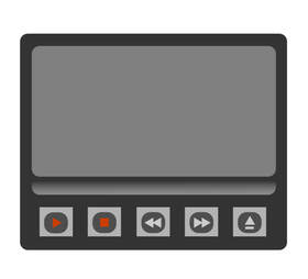 I ran into some roadblocks with using Procreate to lay out pieces of the UI and may instead convert to Photoshop. Photoshop is more precise with placements and is better for this type of work such as positioning pieces. I need to work on my time management and hopefully having class time can help boost my contributions. Overall, the game is coming along but it may not be on its feet in time. There was a covid outbreak following prom at school, and AP exams are popping up. It’s crunch time.
0 Comments
Between missing school and having Friday off as a holiday, I was only at school one day this week. I didn’t have much time to accomplish work in the classroom but I was able to work from home a bit when I was feeling better. I continued with the UI that I had begun earlier. 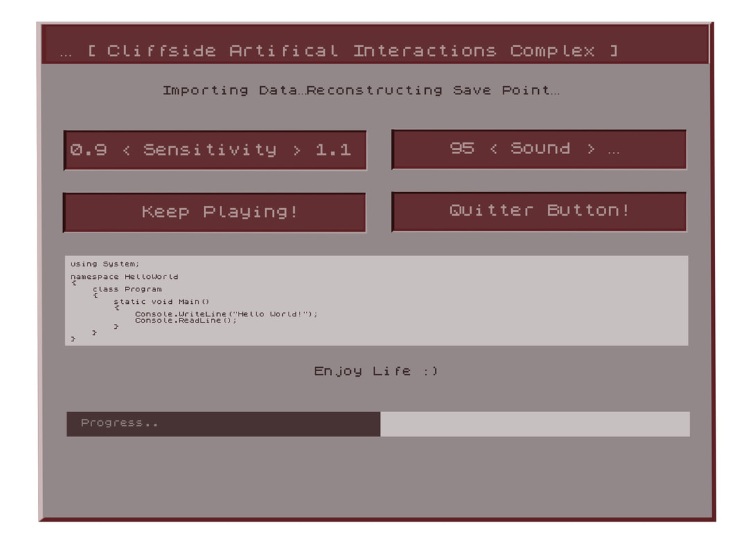 I’m happy with where it’s at. I still need to figure out how to make it pop a bit more and give some depth along the edges. Otherwise, I like the general aesthetic. I can’t say much about how the team has been progressing besides that everyone is doing their part. The only setback for me was not feeling well and being at school only one day. Next week I hope to utilize class time to get back on track and finish this UI once and for all. TLDR:
As the lead 2D Artist for my team, I am currently working on the UI that the player will interact with by the endgame of our development. I wasn’t given a reference for the intended design, so I decided to go based upon my own feel of the game. Mountainheart takes place in an older facility, which led me to the idea of doing something diegetic and fitting with both the time and theme, which brought me to my inspiration: the World Wide Web (the original internet browser) UI, and subsequently the original Microsoft operating system as well. Cliffside is a research facility so it should be sort of tech-y. And it’s oddly advanced for the time period. It is also a horror game so I didn’t want it to pop too much, to where it stands out from the rest of what’s going on. Rather than copy the blue, white, and grey of the Microsoft classic theme, I decided to stick with muted colors that share the same red undertones. This is because Mountainheart, naturally, strikes me that way and it felt right given the name. Mountain + Heart; beige and red. It also does not distract from the game’s horror elements, rather adding to the immersion. 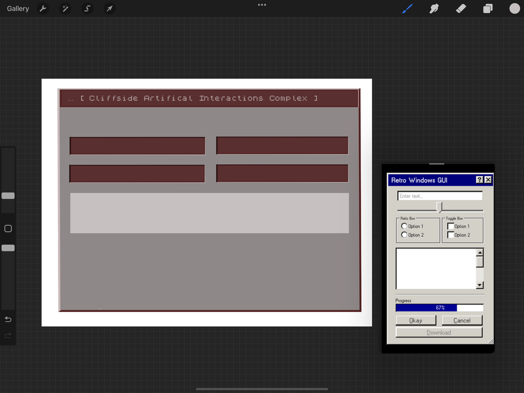 I imported a pixelated font to convey the older operating system and UI, and have been working down to the pixel to add onto that effect elsewhere in the design. It has been a struggle making it look pixelated and low resolution, like an older computer screen, but also clean and friendly to users. I still have features to add and right now its mostly the bare layout; highlights will help it standout, and more buttons will add functionality and fill in the blank space, which I can add after I consult with my team. Right now it is a bit flat and stiff. I need to add the finishing touches and then draw in some dimension, like I said. Overall I think our team has really gotten on track, and I am happy I have had more time to focus on 2D artist things. I would also like to do 3D models in the future, but first the UI is my priority. The settings menu will probably take this week to finish and I may be able to get a jumpstart on the cassette inventory from there, hopefully utilizing some of what I have already made. I have made sure to work with layers so that the design is modular, customizable, and correctable. I look forward to finishing this and am really excited to see how the UI works in game. On the need to know:
theyen it comes to drawing digitally, the software you use can make a huge impact. I will go over some of the features and aspects that I look for most and how programs from my experience compare. The biggest problem with digital software, and digital drawing in general, is the limited navigability and it feeling unnatural. While as in person you can easily adjust the paper you're drawing on and have full control. This is why I think using an iPad or screened tablet is the best option for digital art, because it is easy to have a pencil in one hand and have the other to zoom in/out as well as angle the canvas. However not all programs make this easy, and using tablets such as Wacom's may not give you this ability. I feel like this is an extremely important feature for making a natural and smooth experience, and is a feature I think Procreate particularly has knocked out of the water. Photoshop and other apps do not even give that possibility, while others struggle with palm rejection or poor response. The UI is also extremely important when judging an app. For me, I like having the most essential tools right at my fingertip and having more advanced features hidden but still available. Apps like Photoshop and Krita are extremely tool and feature heavy however they are not organized in an efficient manner for drawing, and there is so many things you will never use. They are also hard to adjust quickly. However apps like Procreate, Autodesk Sketchbook, Leonardo, and Sketchable all have extremely simple and visually appealing UI's that layout the most essential tools in an easily adjustable manner. Brushes and brush settings, such as opacity, hardness, and size are things that need to be adjusted on the fly otherwise it can make the experience very slow and boring. Procreate has a slider on the side that makes it extremely quick and easy, for example. It is also important to have more advanced tools that allow you to make adjustments as well as add cool effects. Some apps do not offer much outside the basic tools, while others supply an overwhelming amount, so it is important to find an app that has the perfect balance for what you use. Adjusting layers is also more important than you would think. I find myself duplicating, merging, and changing the opacity/visibility of layers very often and that is another example of something that needs to be incorporated into the user interface. 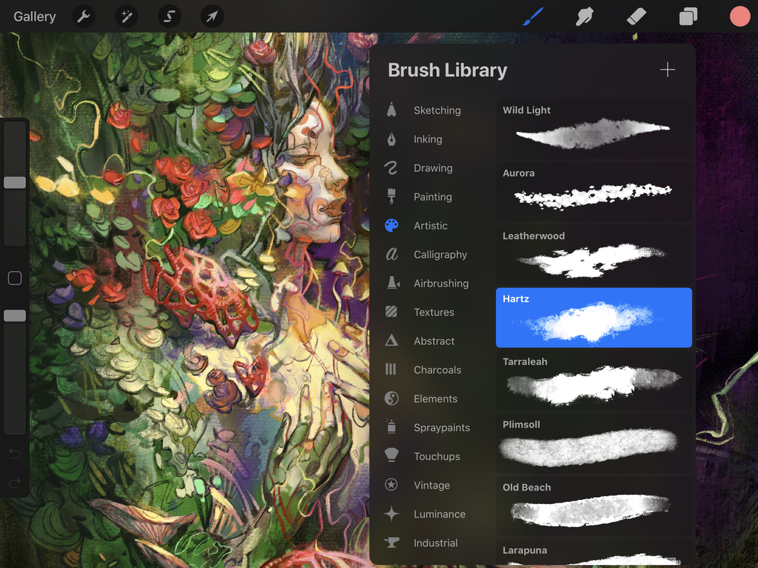 Of course, tools is what it comes down to. Not just having the tools available, but also how well they work. The most prominent example of this is the blending tool or magic lasso. Some apps have blending tools that merely blur and do not give much control, and this has been the hardest thing to find in an app. While most artists try to build their technique without relying on a blender, especially in Photoshop, and instead use soft brushes, I find it an extremely useful tool to have. Again, Procreate knocked it out of the park, and surprisingly very few programs have properly incorporated/designed this tool. In most apps it simply feels like a blur tool rather than controlled blending. The magic lasso is another important, and slightly more advanced, drawing tool I have come to love. Not all programs have it or have one that works quickly and efficiently, but it is extremely useful for adjusting certain pieces on a layer. Brushes are another tool that can make or break a program. Many have very limited brushes, whereas I like being able to import my own or having a well organized and versatile collection to switch between. This is especially useful for stylization or getting different types of details more easily. Procreate has a great selection it comes with that are well organized. It also allows users to easily make their own brushes as well as modify them or import new ones. Photoshop also does a good job with this, however I find it inconvenient when switching between them. Overall:
Everyone struggles with finding inspiration, getting motivated, and actually being productive. I would often find myself wasting away my day just looking for things to pass time. However there are ways to get out of these cycles or depressions and get motivated. First off, try to develop good sleep habits. Stick to a sleep schedule and get adequate sleep. This will help boost your energy and give you more regular hours. Exercise and diet also come in and are important for maintaining energy. Don't just lie around in bed and expect to get work done from there either. It is important to go and sit as a desk or workspace and not be in a slouched or lazy position. Having a minimalistic and clean setup can also help you feel more organized and get you in the productive mindstate without any distractions or clutter weighing you down. Surrounding yourself with natural light and happy music can also boost your mood as well. Keeping a healthy mindstate, however, is the most crucial of all. Nothing else matters unless you have your priorities set and are in a stable and happy mental state. Do not focus on your shortcomings, but focus on improving them or looking forward to the future, and work for it. Don't get demotivated by seeing other peoples work or accomplishments either, but instead try to use them for inspiration or to set goals. Set your priorities and don't get too ahead of yourself. Focus on one thing at a time. It is important to understand what you want in life and the first step to becoming productive is to place your values there. It is also important to break away from any addictions or bad habits that hold you back. Think about what will stick with you in the long haul. The most important piece of advice is to not settle for isolation or loneliness, but try to maintain healthy social relationships and surround yourself with people who help bring out your best. Finally, remember that results don't come right away and practice is the key to getting to where you want to be. Even if it looks hopeless at first. Watching tutorials can be helpful, but ultimately it comes down to trial and error. Conclusively:
Many artists and creatives have a hard time finding the device that suits them best. Now that I have used all of these, I will give a comprehensive review and elaborate on my preferences of each. As a digital artist, I value comfortability to get through extended periods of drawing, as well as convenience and functionality above all. The operating system and available software for each also comes into question. I will be judging each off of these categories. 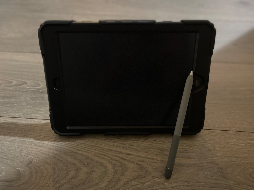 To start is the iPad. I have the 10.2 inch with the first gen apple pencil. The iPad is my go-to device for many reasons. Personally, I like to be able to draw anywhere and in any position, which the iPad can do. It is the perfect size and is very light. This allows maximum comfort while drawing. The screen and Apple Pencil are responsive and have no latency. The iPad however falls short on software. Although many popular apps such as Photoshop are making mobile versions to go with the iPad, they don't compare to the Windows versions. And even still, users are severely limited on programs. However Procreate is exclusive to the iPad on the other hand, and is easily my favorite app for drawing/painting, giving the iPad a HUGE plus. Not only is it very intuitive, but it also has a top tier layout that allows for maximum efficiency and is packed with most of the essential features. The blending and brush selection are high quality, and adjustments to opacity or brush size are extremely easy, as well as color picking. The iPad can come in pretty expensive however, and is only strong for quick painting/drawing, with a limited selection of apps. It also dies relatively quickly. On the other hand the pros are its easy portability and the ability it gives users to draw in comfortable positions, as well as its exclusive access to Procreate. 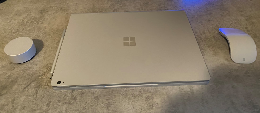 Next up is the Surface Book 3. This is an incredible all in one device. It works as a high functioning laptop and can also detatch its screen to become a tablet. While giving you similar portability as the iPad, it lacks slightly in comfort. The pen sensitivity also doesn't feel as natural as the Apple Pencil and iPad. Furthermore, drawing on glass doesn't give the greatest or most natural feel, and unlike the iPad there is no way to put on a paper-like screen protector. However it has access to windows and can run high capacity programs such as those in the adobe creative cloud, including Photoshop with access to all the features. Popping off the screen also transforms it into a very similar experience as the iPad, while keeping it attached allows you to work in more advanced programs that take more CPU power, giving you an ability not provided by the iPad. For just drawing the iPad is a better choice, however overall this device has a lot more capability and is still very convenient and comfortable, although it comes in at a much higher price. 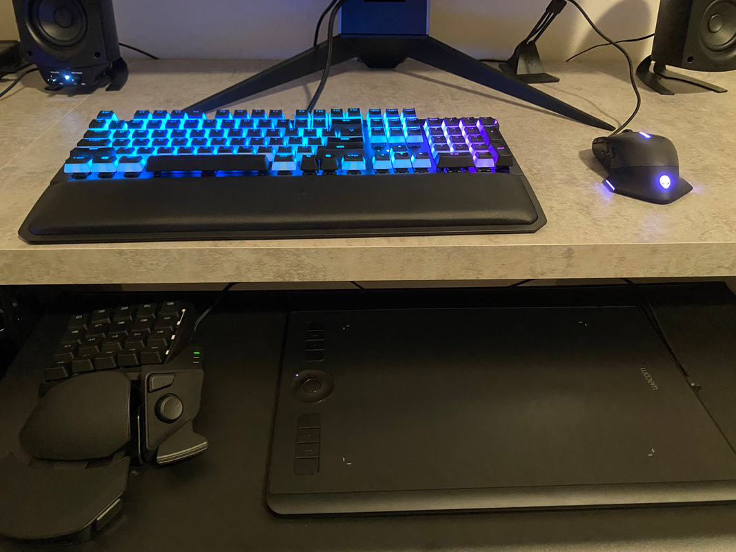 Finally, is the Wacom tablet. This can be hooked up into a windows PC and is not a standalone device unlike the others. Even still, it comes in at a relatively hefty pricepoint. It also lacks in comfortability and convenience the most. However it provides the best pen feel and has a nice textured surface. The express keys also come in handy for making drawing on windows a better experience. Furthermore I hooked up a Razer Tartarus gamepad for shortcuts in programs, and it can store multiple saves with custom keybinds. These two devices together are a deadly combo. The Intuos also has the largest learning curve since it takes a while to learn to draw indirectly, in that you're not looking directly at where you're drawing. This device is essentially only for drawing and sculpting, as well as some photo editing. However it is the best device if you already have a powerful PC and want to save money. It also has the best feel of all of them and can work in any program. Overall, it depends on every individuals needs, but for drawing/painting I would say the iPad is the best device and comes near the top in every category. In Conclusion:
Recently my class has been learning about the game design process, specifically the careers that are involved. Looking at these specific jobs, there are definitely some that peak my interest, that could be potential career paths I want to follow. I find myself to be a pretty naturally inclined artist and I have always picked up on drawing. This would lead me into the pathway option of 2D Artist. I really enjoy drawing and find that it comes with a lot more freedom than most other positions, which are usually working off of the concept by the 2D Artists. Since I am very creative and especially great at drawing creatures/humans, I think a character concept artist would be a really great position to suit me. Not only would it give me a lot of creative freedom, but I would also be able to do what I love. 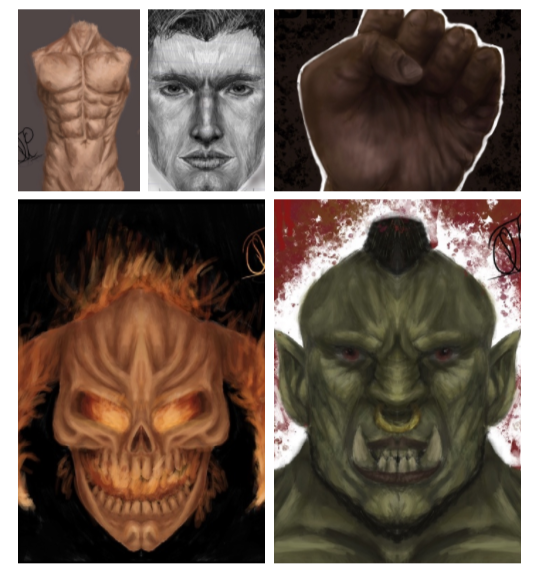 Another option I am interested in is to be a 3D Modeler. I have really enjoyed my experience with Blender in particular and love the workflow of 3D Modeling. It is a very invigorating challenge to try to figure out what technique and specific path to take in order to create a particular asset or character. There are so many different ways to accomplish any given task, and modeling always has something new to offer. Being able to contribute directly to the end project of what players will actually see and interact with in the video game, would be really awesome to be a part of. 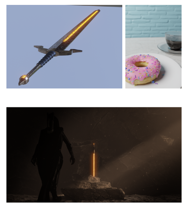 Although I was mildly surprised to learn that there was an official Writer position, it made a lot of sense. The writing, script, and plot to a game are arguably the most crucial aspect. Great scenery means nothing without an intriguing storyline to follow. I feel like this would be a great fit for me because I am a good writer and this position would also give me a lot of freedom to help develop a suspenseful plot, add in witty humor, and give life to the characters; all things I think I would strive at. Though I find interest in each of these individual jobs and components of the development team, I think I could also potentially make a great Art Director. This position would combine a lot of the skills I have been developing in this class such as 2D Art, 3D Modeling, Animating, and Texturing all into one job. The Art Director oversees a lot of the creativity and visual components of the project. As someone who has experience in all these fields, as well as many of the soft skills that come with this job such as interpersonal communication. creativity, and leadership, this would be a good goal to work up to. This proves to me it is important to keep up with all these hard skills, but also join extracurricular and take opportunities to develop a more impressive portfolio for soft skills too. Overall I think it is important to have some idea of what to look forward to in the future, and begin preparing now. 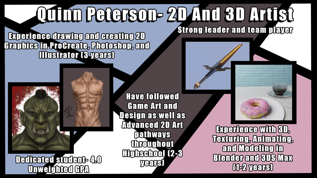 Summary:
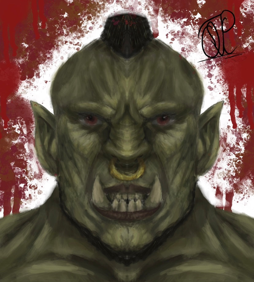
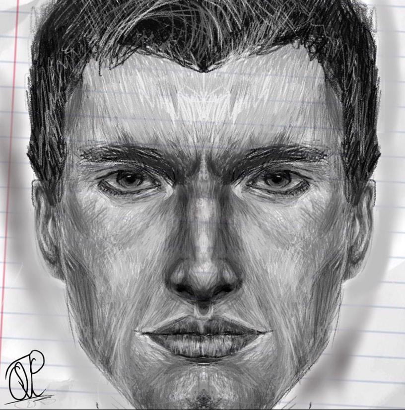
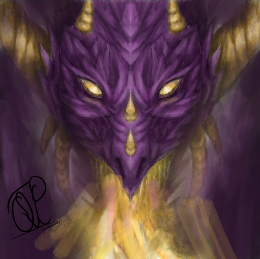
Being a new artist is always extremely hard. Whether its being overwhelmed by trying to start with too much, not knowing where to begin, or being demotivated by seeing art way better online, every artist has issues starting out. For me, it was all three of these. I overestimated my abilities and tried starting with too much.  For example this is the first piece I attempted. Although I did use reference, which helped, it looks significantly different from what I was going off of. Even with a reference photo, it is extremely hard to get proportions correct and to get around face anatomy. This piece was way too much too soon, because not only was it a hard angle, but the lighting had dark tones of blue and grey, which is not a good place to start for artists new to shading skin tone, like me. After that I decided to take a step back, and moved on to simpler pieces, all using the symmetry feature, reducing my workload and allowing me to do a simple front view drawing. I also freestyled the design, with a theme in mind which was fantasy creatures. By doing my own design, I had more freedom and it made drawing a more comfortable experience. Overall, for me it was important to start on front view pieces with symmetry and no complicated angles or lighting.
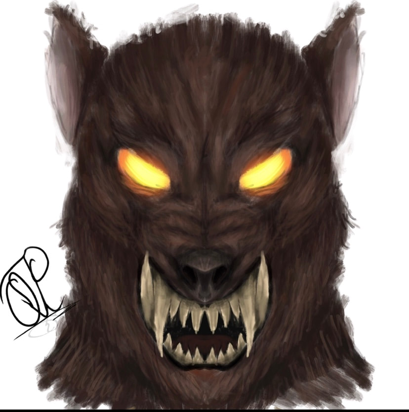
After I felt more comfortable with basic shading techniques and getting around different types of facial anatomy, I thought it was time to try body anatomy and do a slightly unsymmetrical angle (no symmetry on) in order to experiment with different shading as well as lighting. I also added in some of my own stylization with a unique brush I downloaded. I used reference photos which is important because it can take a while to get a good grasp on anatomy due to the substantial amount of details.  Overall I think it is important to pace yourself as an introductory artist, and start with the basics. Throughout this process I feel like I improved significantly just by taking it slow, and am excited to see how I progress in the future. In a nutshell:
|
AuthorMy name is Quinn Peterson! I will be reflecting about my art work in this blog! Archives
May 2022
Categories
All
|
 RSS Feed
