|
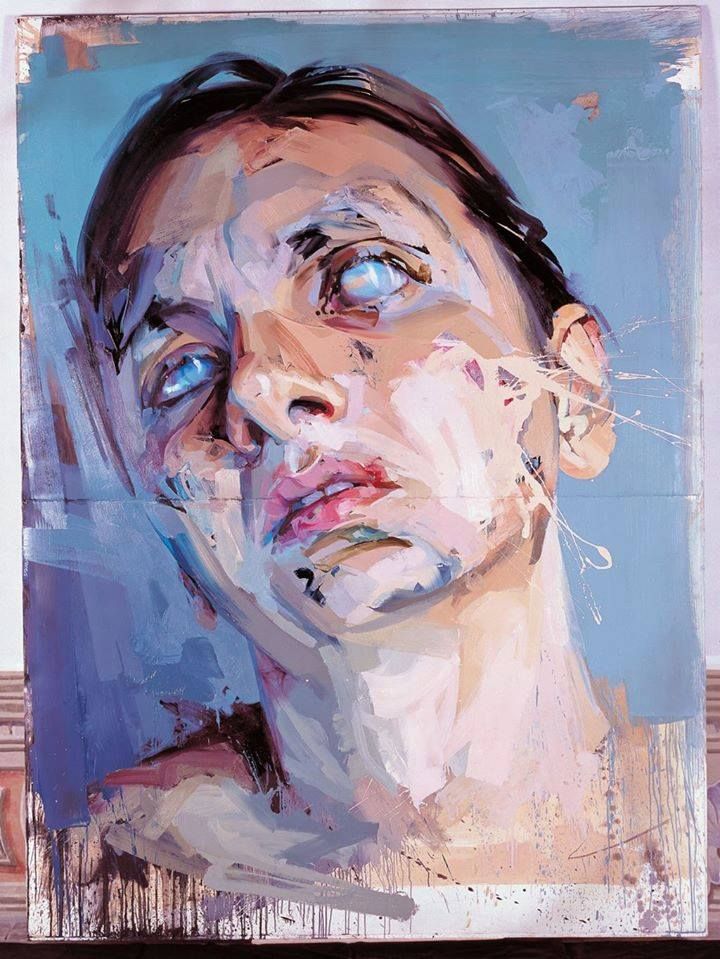
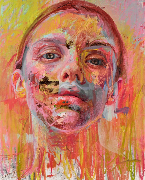
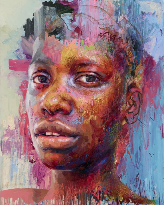
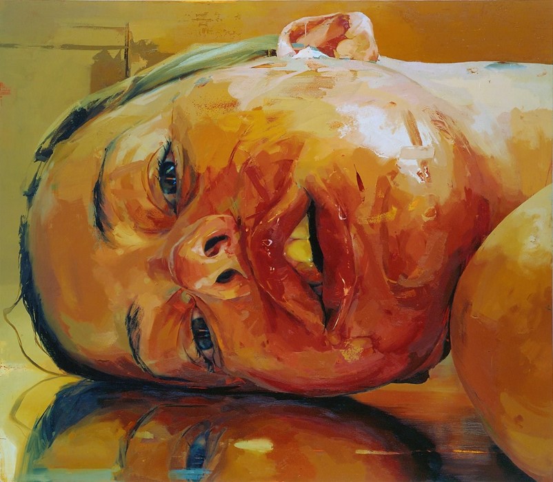
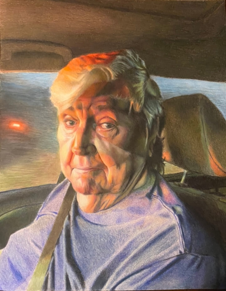
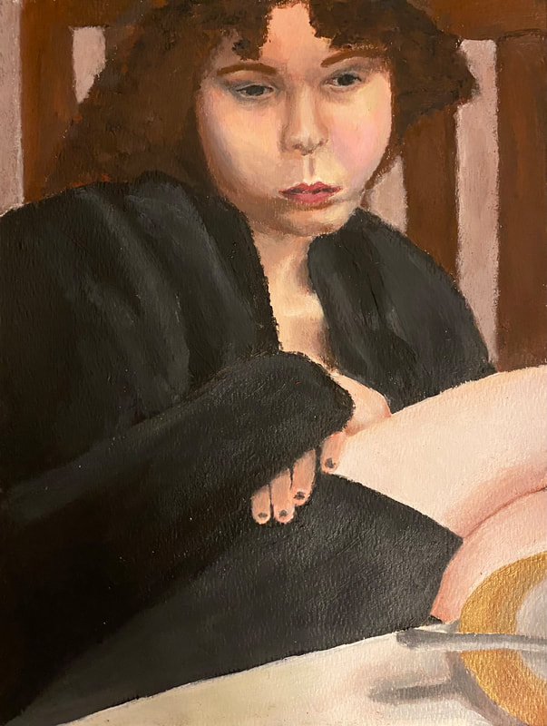
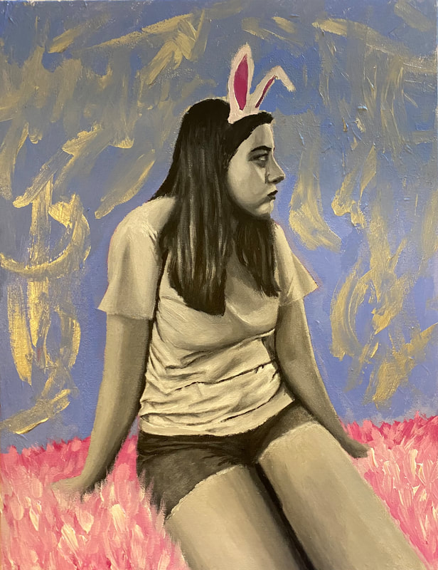
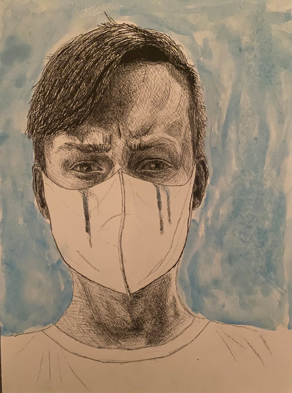
Throughout his year, because I am enrolled in AP Portfolio, I have worked on an independently guided "Investigation" where I create pieces of art based on my own inquiry, done in three week cycles. At the end of the year I submit a compilation of the artworks I created that go with the prompt I chose for myself, and with personal relevance to my own interests. My inquiry question is: "How can sublimated emotions be nuanced through psychological revealing portraits using abstract realism?" As someone who has dealt with suppressed feelings, I thought this was a suitable inquiry with the most connection to who I am as a person, that also reaches into my interests in psychology and my strengths in drawing people/faces. I have drawn a lot of inspiration from Jenny Saville, who is my favorite artist and does similar inquiries (but with much more skill of course). Here are some of her works, for reference:
So far, I have expanded my horizons and forested some unchartered territory. Surprisingly, despite keeping up with art classes for most of my life (except two years in middle school), I have not gotten to use many of the rudimentary -and, foundational -mediums such as acrylic and colored pencil, along with pen and watercolor. I don't know how I have gone so many years taking art classes without having much real experience using these, but I finally took it upon myself to give them a try. And here were the results:
As you can see above, the final paintings and drawings could still use touchups, and they definitely show an amateur skill level. I know that in the future, after having already gotten through some of the tribulations of using a medium for the first time, I could create better pieces of art without using as much time trying to conquer the holes in my experience that have made themselves apparent throughout every piece. However, for now I am pretty satisfied with my experimentation and process, especially given these were all first times for me Because of this trial and error, and from giving new things a shot, I have improved at least tenfold as an artist. I think I could apply the knowledge and bits of process I have learned to value from traditional mediums, and carry it over effectively to digital art; especially in terms of colour choice and layering strokes. Colored pencils, for one, have taught me a lot about patience, and I underestimated how much time is required to get the level of clarity/detail and blending they give, making me appreciate digital art's offerings in efficiency. Painting, on the other hand, was more efficient than I thought, but blending was a lot less smooth than any other medium which was opposite my expectations, and definitely forced me to improve my off-canvas blending abilities. Ultimately, now I can say with 99% certainty, that improvement as an artist comes down to how much you push yourself and tread new ground, and ultimately it is the process - not the end results- that counts. To this day I am still unsure how much art ability is nurture versus nature, which could be an interesting discussion for another day, but I truly believe practice and overcoming these initial road bumps is the key in clearing way for future greatness (not that I will ever be). Takeaways from my experience:
0 Comments
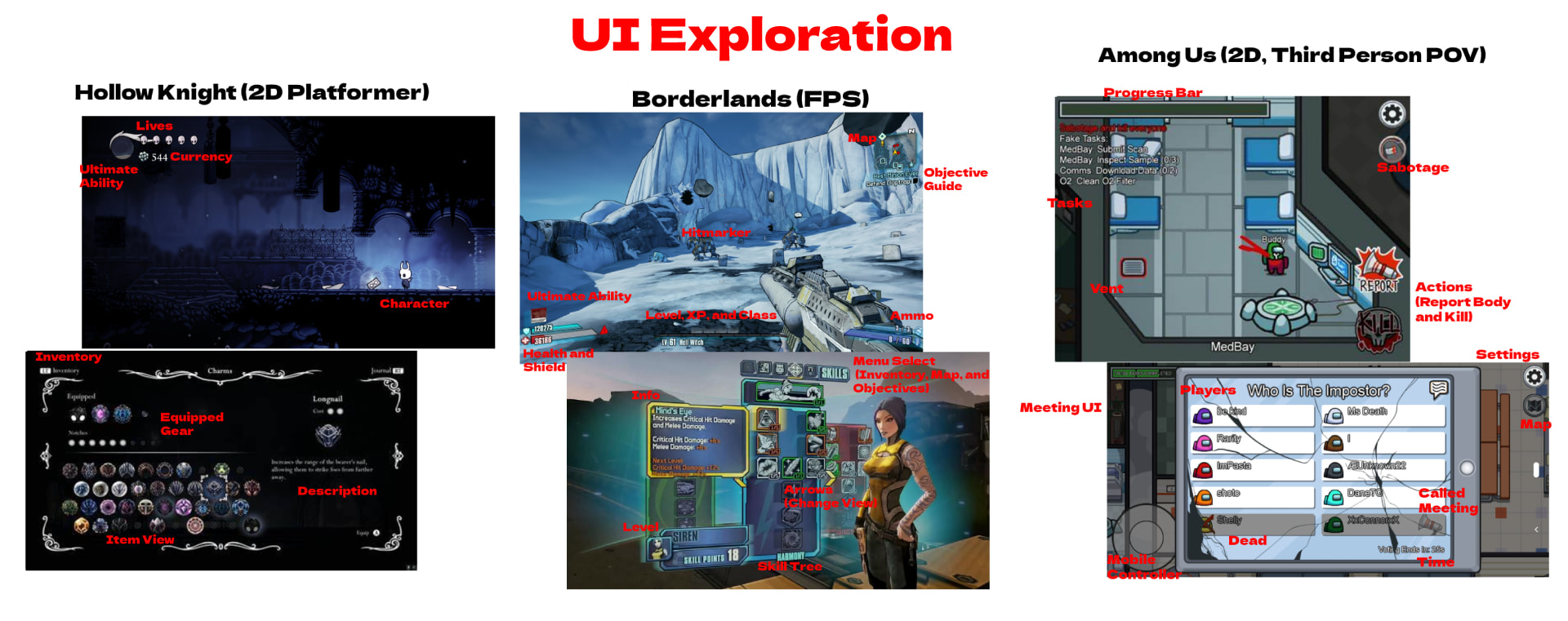 In this post I will be dissecting the different elements of user interface design regarding three different video games all hailing from separate genres, including: Hollow Knight, Borderlands 2, and Among Us. There are many design choices that go into the User Interface that help make a more immersive experience that bridges the gap between reality and the limitations of our control in a distant digital world; the goal being to keep our awareness and frustrations of our inherent disconnection at a subliminal level. It is important to the player that controlling their character feels as natural, and within a similar threshold of capability, as moving in real life. A poor UI design will become confusing or demotivating to a player, and will disrupt their immersion, resulting in a dissonance between the them and the gameplay itself. Playing the game should feel like second-nature, placing emphasis on the interface being intuitive, simplistic and not overly complicated/crowded, and able to assist gameplay where needed. 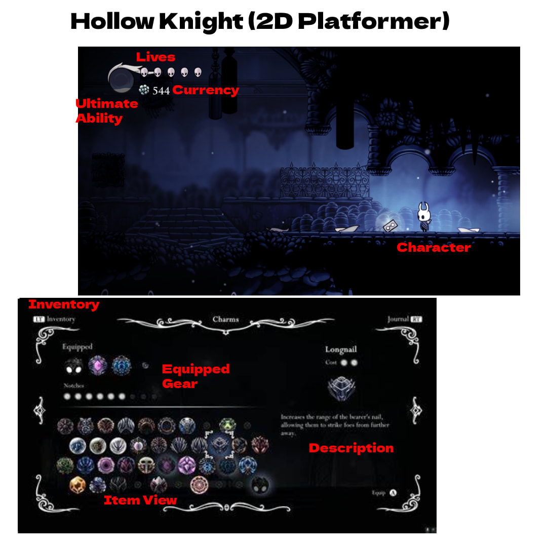 To start, I will analyze Hollow Knight. Albeit a minimalistic UI, it is undoubtedly well developed. Everything is portrayed in an easy-to-understand manner, with only the bare necessities presented, such as: number of lives, health, currency, and ability charge, with alternative menus for more in-depth mechanics such as inventory, dialogue (interacting with other characters), etc.. This allows the player to ease in and not be overwhelmed, while still providing the deeper mechanics and options that are needed for such a game. It explains and details things where it needs to, but is otherwise intuitive and not overbearing; leaving a clean and sleek user interface as a result. 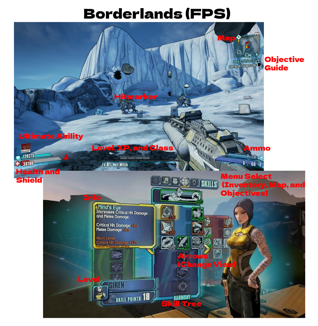 This is where the UI really boils down to the genre. Already, the stark differences between them are dramatic. Although, if you look closer, there are still the same essential components such as level, health, ability charge, map, and objectives. It just looks a lot different because it is overlaying a different view point. The UI typically accompanies the mechanics of the game, which a game like Borderlands definitely has more of. However, you can definitely find a pattern: there are always alternative menus for the nitty-gritty information and specs versus the bare necessities displayed on the main-view UI. Borderlands does a fantastic job at blending the UI to the 3d environment without excessive contrast, and at presenting the needed information in an intuitive way. 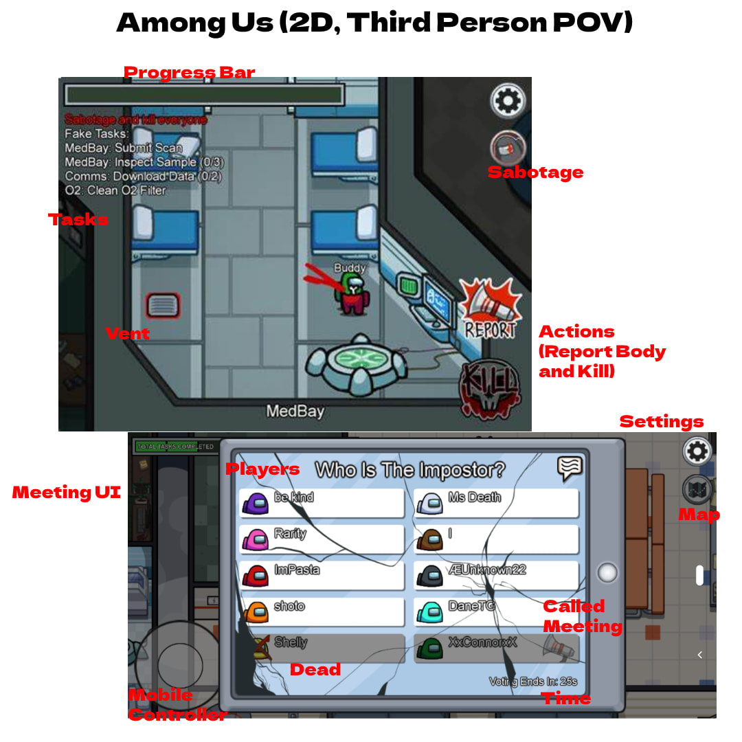 Lastly, is Among Us, which is a bit harder top ascribe into a particular "type of game" category. It is a 2D game with some 3D aspects. The Among Us user interface revolves around the game mechanics, such as movement controls, action commands, objectives, and a progress bar. What makes the UI unique is that its designed for cross-platform gameplay and uses more buttons keeping in mind mobile players, whereas other games would not typically have a setting button in a corner since it is usually a designated button on the keyboard or controller. This also makes it a little more convenient and less hands-on with focus towards casualty. Among Us has the extra touch of outlining every task in the top left corner, which can be seen as a bit rudimentary in terms of design choice; on one hand, it is intuitive, but on the other it is a bit congested and superfluous. This could be better incorporated in an alternative pop-out menu or in an abbreviated way that takes up less screen space and time to read. Overall takeaways:
|
AuthorMy name is Quinn Peterson! I will be reflecting about my art work in this blog! Archives
May 2022
Categories
All
|
 RSS Feed
