|
Finally, exams are finished! I completed my final two, which were make-ups from when I missed school (the covid chronicles). Although they took up a portion of my week, I still got some classroom days to work. Mostly I spent time gathering various textures for where needed, however I also made this Row 3 logo to be used in the game. 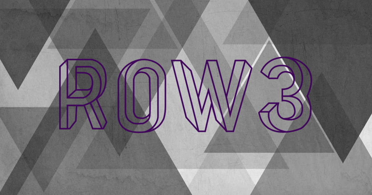
We’re pretty much in the final stretches and this will be the last check-in of the year. Aside from this weekend, time to work has come to a close. Ultimately I think we accomplished the necessities and bare minimum, but came to realize how grand of a scope Mountainheart was in the first place. We’re certainly turning in an abridged version of the original concept and gameplay, and it is not as polished as we may have hoped. Between covid and exam interruptions, we haven’t had much face to face time these last few weeks which has made this more difficult; there also hasn’t been much communication outside of class. Regardless, I think we accomplished enough to call it a working game, and even more important is that we have learned a lot throughout development. Summary:
0 Comments
I was out the entirety of the week with covid and with AP exams rolling by, I have been bogged down on two different fronts. I haven’t found a significant amount of time to set aside for this class or to prioritize our game, especially since it seems like it may not come to fruition in time. In the time I did work, I continued with what I had been working on before; graphics and UI adjustments. 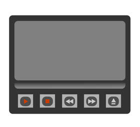 I ran into some roadblocks with using Procreate to lay out pieces of the UI and may instead convert to Photoshop. Photoshop is more precise with placements and is better for this type of work such as positioning pieces. I need to work on my time management and hopefully having class time can help boost my contributions. Overall, the game is coming along but it may not be on its feet in time. There was a covid outbreak following prom at school, and AP exams are popping up. It’s crunch time. This last week was spent working on the Cliffside logo in class, as well as the UI at home. The logo was inspired by a retro wave style theme and a font called ‘groovy.’ I was searching for inspiration that encapsulated the way I envisioned the 60s aesthetic and vibe. I downloaded a free font similar to what I liked and then watched a tutorial for text layering in order to create the intended effect (type shift). I think it turned out well but was way more difficult and time-consuming than it should have been for something so simple, and felt very unintuitive which is again why I hate Photoshop. For a program with an overload of tools, the features aren’t ever there when you need them. Although it’s a simple text effect, I think having a logo and building the vibe sets an important tone for the entire game. I like the juxtaposition between the look of Cliffside’s logo and the actual environment inside the abandoned facility. It’s eerily welcoming. 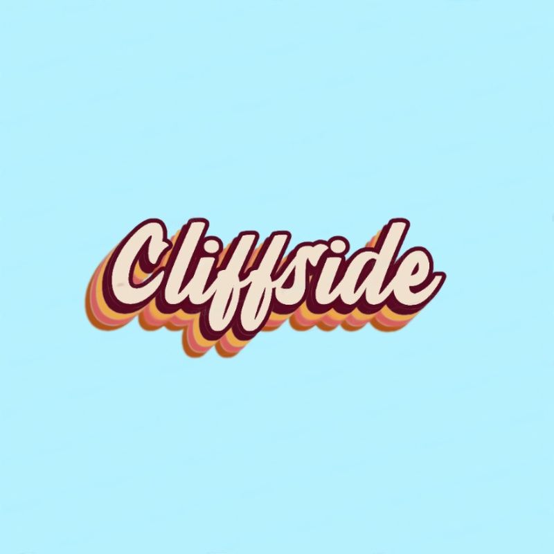 My group has also made a good deal of progress with the UI functionality and audio effects. It’s nice to see it all come together. I also came up with and brainstormed a few ideas on how we could add some stylism and humor that conveys the game’s personality; when trying to quit, the game the screen will pop up with the usual “are you sure you want to quit?” followed by a spam entry of “are you absolutely, positively sure you want to quit?” like a cascade of pop-up ads or viruses on an old computer OS. I think this is a prime example of the Mountainheart game “feel” we are going for. Coming up with and adding creative features like this has helped build some morale and hype for our game. Everyone seems to be on the same page and way more unified, though we still aren’t as far as we need to be. This upcoming week will be focused on finishing the UI completely and all of the aesthetic aspects. I will do the finishing touches on the logo, and continue with the UI which will hopefully be done by the end of the week. Recap:
As the lead 2D Artist for my team, I am currently working on the UI that the player will interact with by the endgame of our development. I wasn’t given a reference for the intended design, so I decided to go based upon my own feel of the game. Mountainheart takes place in an older facility, which led me to the idea of doing something diegetic and fitting with both the time and theme, which brought me to my inspiration: the World Wide Web (the original internet browser) UI, and subsequently the original Microsoft operating system as well. Cliffside is a research facility so it should be sort of tech-y. And it’s oddly advanced for the time period. It is also a horror game so I didn’t want it to pop too much, to where it stands out from the rest of what’s going on. Rather than copy the blue, white, and grey of the Microsoft classic theme, I decided to stick with muted colors that share the same red undertones. This is because Mountainheart, naturally, strikes me that way and it felt right given the name. Mountain + Heart; beige and red. It also does not distract from the game’s horror elements, rather adding to the immersion. 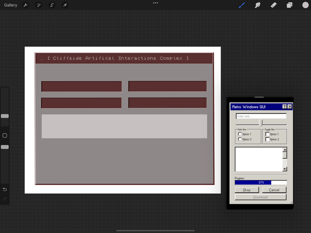 I imported a pixelated font to convey the older operating system and UI, and have been working down to the pixel to add onto that effect elsewhere in the design. It has been a struggle making it look pixelated and low resolution, like an older computer screen, but also clean and friendly to users. I still have features to add and right now its mostly the bare layout; highlights will help it standout, and more buttons will add functionality and fill in the blank space, which I can add after I consult with my team. Right now it is a bit flat and stiff. I need to add the finishing touches and then draw in some dimension, like I said. Overall I think our team has really gotten on track, and I am happy I have had more time to focus on 2D artist things. I would also like to do 3D models in the future, but first the UI is my priority. The settings menu will probably take this week to finish and I may be able to get a jumpstart on the cassette inventory from there, hopefully utilizing some of what I have already made. I have made sure to work with layers so that the design is modular, customizable, and correctable. I look forward to finishing this and am really excited to see how the UI works in game. On the need to know:
This week I have focused on my responsibilities as the primary and lead artist of my group. Xander and I have worked on the conceptualization of the UI design together, while I have been putting it together in Illustrator. Rather than a play-head button, we decided to do something more unique and have an actual cassette on the player's screen. This adds to the immersion of the game and will more strongly engage the player. It also increases the functionality by having several buttons available, such as the eject and rewind/fast-forward buttons, as would a real-life cassette player. We plan to animate it as well so that the player can visualize the tape's progression as well as swap the individual tapes in and out of the player. This way it would mirror a real cassette tape and player. We may also change the design of each different tape, or number them according to their serial so that the player can differentiate them easily. As for the actual design, since Mountainheart takes place in a facility from the 60s, we decided to do a similar color theme as demonstrated by the muted beige background highlighted with the vibrant pastel lines. 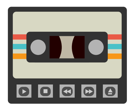  Because it's a UI component, and for the sake of remaining cohesive, I decided to go the route of making the tape simple and somewhat cartoony. Not only was this easier to make from scratch, but it also gave necessary leeway for the design to be modular and customizable. However, because Mountainheart is a horror game and takes place in a dilapidated facility, I decided to touch it up in Photoshop by adding a texture to help convey the more rustic and eerie ambience; a fine compromise between hyper-realistic and overly cartoony. Since I used a modular approach to designing the tape, and because its a vector designed in Illustrator, we can always make edits and nitpicks. As for now, I am very happy with how the simplistic design meshes with the texture. It definitely encapsulates what I was going for without any shortcuts, and it is definitely the feel we were going for. Xander is still experimenting and wants to try a pixel based UI as well, which may be something else we test out. I also need to work on the other components of the UI, but this is the focal piece. From here, we plan to animate the cassette as well as begin integrating into Unity while I finish the rest of the UI. As for my responsibilities as team lead, the project is on track although a few of my peers have been stagnant in their work this week. I can't always be watching over their shoulder, especially when I'm actively working on important pieces for the game. I incentivize them whenever and wherever I can, but there are limits to my power and time. There is a lot to get done and not only am I actively working in class the most, I also have to organize the team which is even harder than it sounds. Overall:
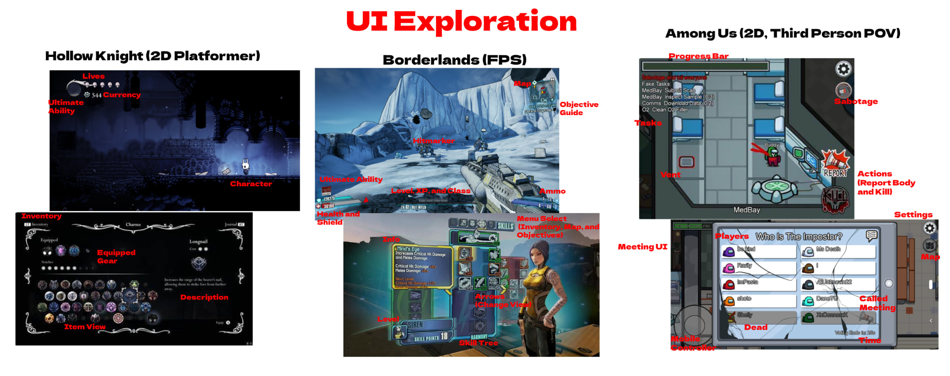 In this post I will be dissecting the different elements of user interface design regarding three different video games all hailing from separate genres, including: Hollow Knight, Borderlands 2, and Among Us. There are many design choices that go into the User Interface that help make a more immersive experience that bridges the gap between reality and the limitations of our control in a distant digital world; the goal being to keep our awareness and frustrations of our inherent disconnection at a subliminal level. It is important to the player that controlling their character feels as natural, and within a similar threshold of capability, as moving in real life. A poor UI design will become confusing or demotivating to a player, and will disrupt their immersion, resulting in a dissonance between the them and the gameplay itself. Playing the game should feel like second-nature, placing emphasis on the interface being intuitive, simplistic and not overly complicated/crowded, and able to assist gameplay where needed. 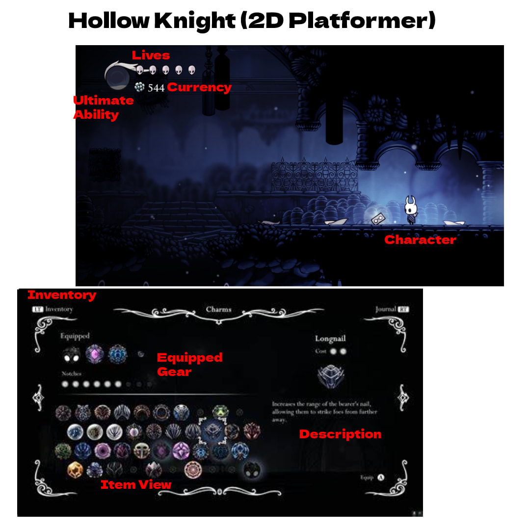 To start, I will analyze Hollow Knight. Albeit a minimalistic UI, it is undoubtedly well developed. Everything is portrayed in an easy-to-understand manner, with only the bare necessities presented, such as: number of lives, health, currency, and ability charge, with alternative menus for more in-depth mechanics such as inventory, dialogue (interacting with other characters), etc.. This allows the player to ease in and not be overwhelmed, while still providing the deeper mechanics and options that are needed for such a game. It explains and details things where it needs to, but is otherwise intuitive and not overbearing; leaving a clean and sleek user interface as a result. 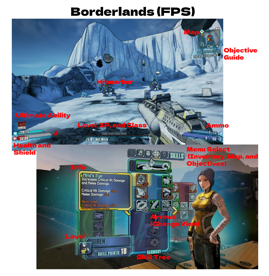 This is where the UI really boils down to the genre. Already, the stark differences between them are dramatic. Although, if you look closer, there are still the same essential components such as level, health, ability charge, map, and objectives. It just looks a lot different because it is overlaying a different view point. The UI typically accompanies the mechanics of the game, which a game like Borderlands definitely has more of. However, you can definitely find a pattern: there are always alternative menus for the nitty-gritty information and specs versus the bare necessities displayed on the main-view UI. Borderlands does a fantastic job at blending the UI to the 3d environment without excessive contrast, and at presenting the needed information in an intuitive way. 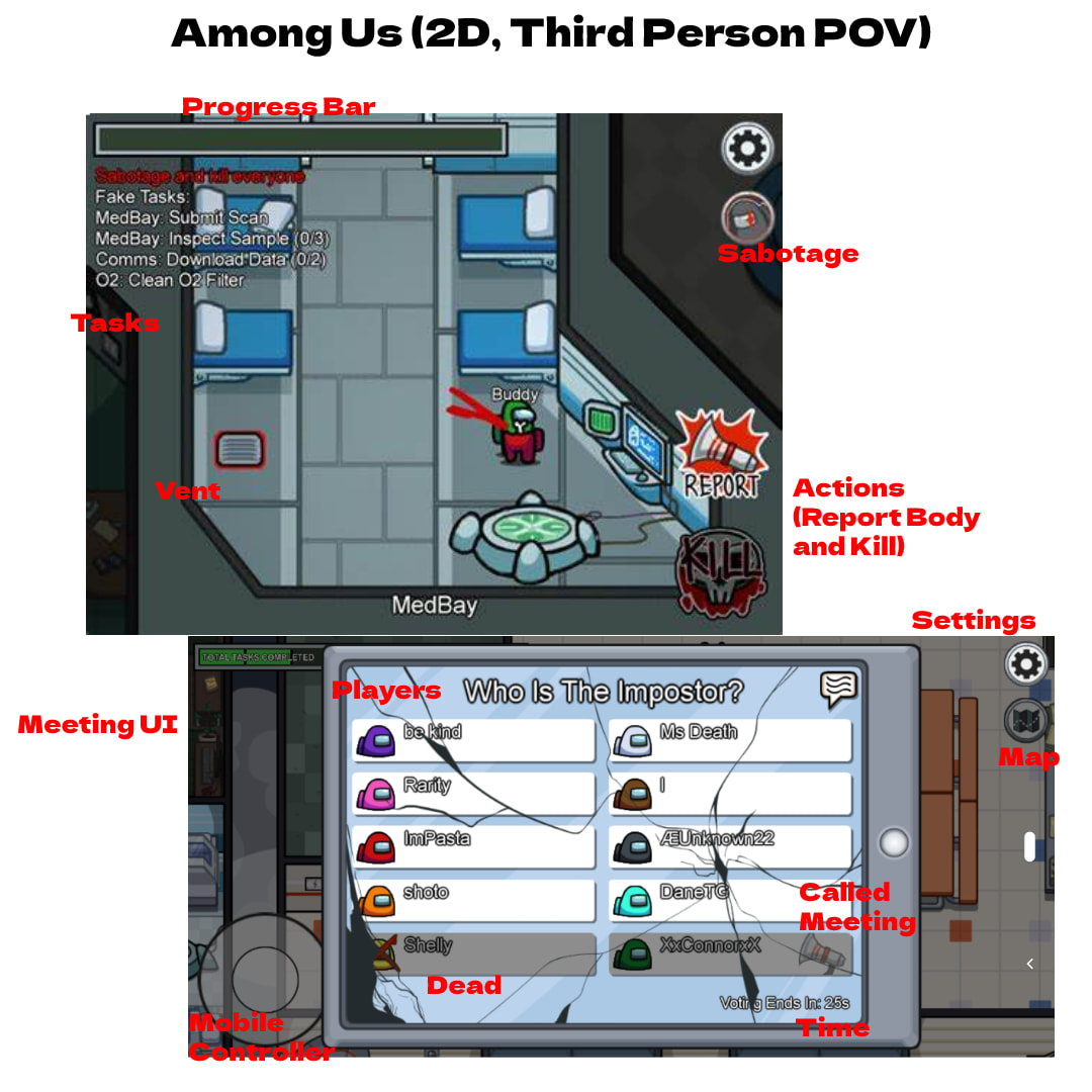 Lastly, is Among Us, which is a bit harder top ascribe into a particular "type of game" category. It is a 2D game with some 3D aspects. The Among Us user interface revolves around the game mechanics, such as movement controls, action commands, objectives, and a progress bar. What makes the UI unique is that its designed for cross-platform gameplay and uses more buttons keeping in mind mobile players, whereas other games would not typically have a setting button in a corner since it is usually a designated button on the keyboard or controller. This also makes it a little more convenient and less hands-on with focus towards casualty. Among Us has the extra touch of outlining every task in the top left corner, which can be seen as a bit rudimentary in terms of design choice; on one hand, it is intuitive, but on the other it is a bit congested and superfluous. This could be better incorporated in an alternative pop-out menu or in an abbreviated way that takes up less screen space and time to read. Overall takeaways:
Many artists and creatives have a hard time finding the device that suits them best. Now that I have used all of these, I will give a comprehensive review and elaborate on my preferences of each. As a digital artist, I value comfortability to get through extended periods of drawing, as well as convenience and functionality above all. The operating system and available software for each also comes into question. I will be judging each off of these categories. 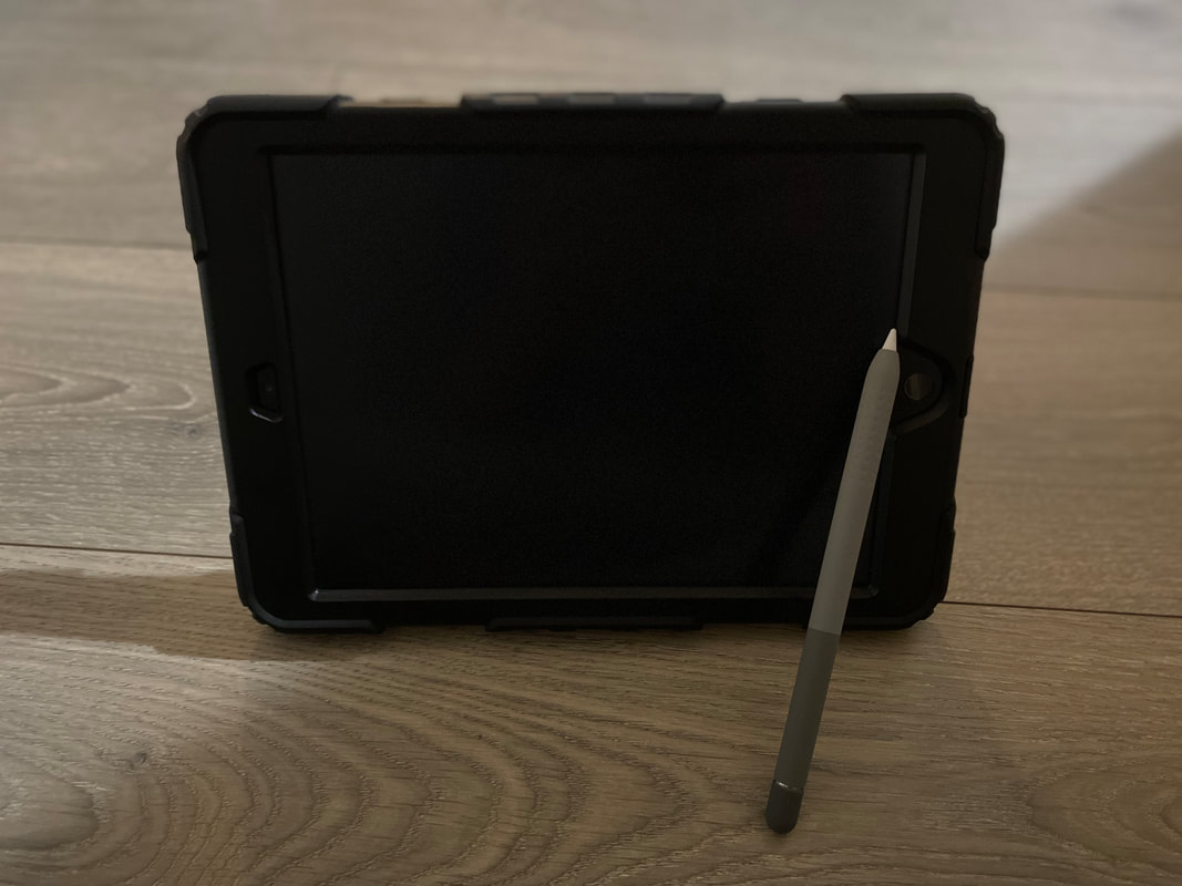 To start is the iPad. I have the 10.2 inch with the first gen apple pencil. The iPad is my go-to device for many reasons. Personally, I like to be able to draw anywhere and in any position, which the iPad can do. It is the perfect size and is very light. This allows maximum comfort while drawing. The screen and Apple Pencil are responsive and have no latency. The iPad however falls short on software. Although many popular apps such as Photoshop are making mobile versions to go with the iPad, they don't compare to the Windows versions. And even still, users are severely limited on programs. However Procreate is exclusive to the iPad on the other hand, and is easily my favorite app for drawing/painting, giving the iPad a HUGE plus. Not only is it very intuitive, but it also has a top tier layout that allows for maximum efficiency and is packed with most of the essential features. The blending and brush selection are high quality, and adjustments to opacity or brush size are extremely easy, as well as color picking. The iPad can come in pretty expensive however, and is only strong for quick painting/drawing, with a limited selection of apps. It also dies relatively quickly. On the other hand the pros are its easy portability and the ability it gives users to draw in comfortable positions, as well as its exclusive access to Procreate. 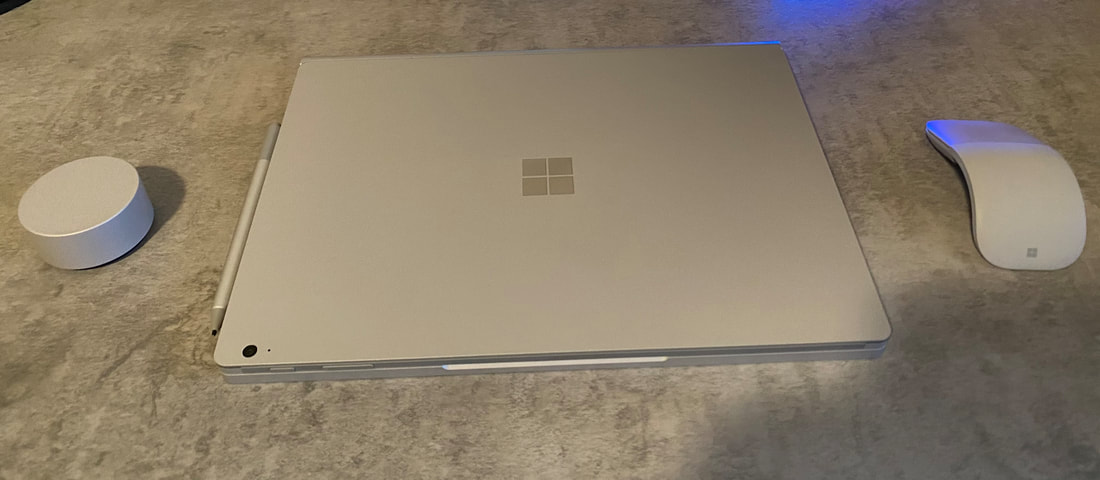 Next up is the Surface Book 3. This is an incredible all in one device. It works as a high functioning laptop and can also detatch its screen to become a tablet. While giving you similar portability as the iPad, it lacks slightly in comfort. The pen sensitivity also doesn't feel as natural as the Apple Pencil and iPad. Furthermore, drawing on glass doesn't give the greatest or most natural feel, and unlike the iPad there is no way to put on a paper-like screen protector. However it has access to windows and can run high capacity programs such as those in the adobe creative cloud, including Photoshop with access to all the features. Popping off the screen also transforms it into a very similar experience as the iPad, while keeping it attached allows you to work in more advanced programs that take more CPU power, giving you an ability not provided by the iPad. For just drawing the iPad is a better choice, however overall this device has a lot more capability and is still very convenient and comfortable, although it comes in at a much higher price. 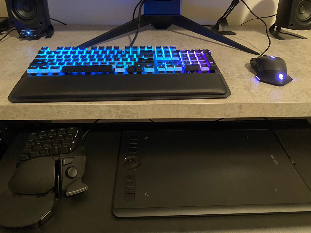 Finally, is the Wacom tablet. This can be hooked up into a windows PC and is not a standalone device unlike the others. Even still, it comes in at a relatively hefty pricepoint. It also lacks in comfortability and convenience the most. However it provides the best pen feel and has a nice textured surface. The express keys also come in handy for making drawing on windows a better experience. Furthermore I hooked up a Razer Tartarus gamepad for shortcuts in programs, and it can store multiple saves with custom keybinds. These two devices together are a deadly combo. The Intuos also has the largest learning curve since it takes a while to learn to draw indirectly, in that you're not looking directly at where you're drawing. This device is essentially only for drawing and sculpting, as well as some photo editing. However it is the best device if you already have a powerful PC and want to save money. It also has the best feel of all of them and can work in any program. Overall, it depends on every individuals needs, but for drawing/painting I would say the iPad is the best device and comes near the top in every category. In Conclusion:
|
AuthorMy name is Quinn Peterson! I will be reflecting about my art work in this blog! Archives
May 2022
Categories
All
|
 RSS Feed
