|
Although in the past I have delved into some ideas and aspirations of what I might want to pursue in the future- especially in the game design industry whether it was as a writer, concept artist, or character artist- I had not yet been fully been versed in, or introduced, to another potential option; programming. At first it seemed appealing to be able to lay the groundwork for a game and truly give it functionality, as well as explore a field that would challenge me intellectually. However after learning some of the fundaments of C# in Unity Learn, I have learned that programming often comes down to memorization, using and compiling resources, constant experimentation/testing, and spending hours just trying to identify and fix a single issue - leaving you despondent and mostly agitated for not seeing the issue sooner. Or at least that's how it was for me. I can not say that I truly understood much of what I was doing and it was much more enticing to precede with superficial knowledge and mostly work off of what other people already had done rather than waste hours doing it completely on my own even with full comprehension. I would rather be creating something original and creative, rather than using/working off of what other people with way more experience or smarts have already done. I also did not feel the "reward" aspect of completing a code as much as I had hoped or envisioned, but rather it felt like a super long and demoralizing process that I did not understand full or do completely on my own. After this experience, I think I can cross programming off of my list of careers that I would like to further explore and endeavor upon. Main emphasis:
0 Comments
An integral part to any game design is the overall concept and the story/plot. A game can have stellar graphics and great gameplay, which may work for online competitive multiplayer games like Overwatch or Valorant, though the greatest games do not solely rely on those things. RPGs in particular require a good concept and story, and also remain my favorite type of game because they can completely emerge/immerse players into an entirely new world and as a different character, within a suspenseful storyline. Delving into entirely new worlds and playing through engrossing narratives, or playing through various missions and conquests, is far more memorable and impactful on players than merely shooting away at other players in online co-ops. In those type of games, matches become repetitive, dull, and forgettable or enraging. On the other hand, a good story in a game can teach a variety of lessons or just be a fun experience full of surprise and adventure. What makes a good story though? Every story must remain logical and avoid major holes or gaps in the story or events. However, especially with things like fantasy and sci-fi, it is okay to veer away from realism and stretch certain ideas even if they may not be scientifically plausible in our modern world. This adds a new layer to the game and makes an experience unique and different from what we are used to in real life, also making it a better escape from reality. However players may obsess on details that are not well explained or may not be believable, so things have to be integrated and conveyed in a way that does not halt the players attention and sense of immersion. A good story also involves plot twists and surprises. Audiences wont enjoy stories that are predictable and follow too many cliches or basic, two-dimensional, plotlines. There should be suspense and intrigue in what happens next, without players rolling their eyes or feeling like the story is shallow. Another important thing is developing relatable characters with flaws and shortcomings. This way the players are not overpowered or against unstackable odds, and also can feel more connected to their protagonist that they're playing as, increasing the immersion and making a more memorable/impactful experience. This is also important with villains. Villains often fall under a power-craving cliche, as I would call it, where they are shallow and just want to rule the universe or obtain some sort of power. However adding more depth to the villains motives and viewpoints can help boost the concept and storyline. Adding side characters that work well in conjunction with the main characters or storyline is also crucial. Creating balanced power systems. Especially in fantasy magic books, it is important to have a magic or power system that is not overpowered for certain characters and that makes sense with no discrepancies. This is important to the gameplay and keeping the game balanced and believable. Being unique. Overall the most important critique is to make the game stand out from others, while also to absorb some of the best elements inspired from other games, shows, or books. In a nutshell:
Game Design was one of my favorite classes during my freshman year and even got me looking into some new career pathways and options. Going into my second year, I'm excited to once again bond with an amazing class full of friends, as well as get to hone in on some skills we scratched last year. I know we will be working a lot more with 3D modeling, which I struggled with the most, but that's why I'm interested to dig deeper into it! Modeling is by far the most complex form of art I've worked with and there are so many amazing things you can create. 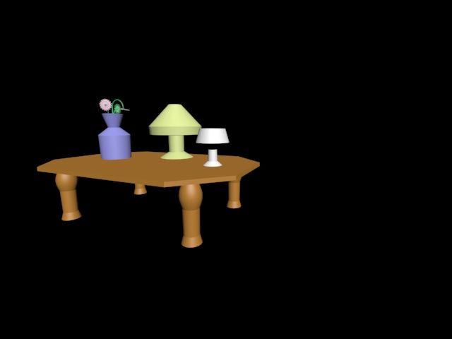 This is a sample of what I created last year. As you can see it is terrible, and that took several days, with help, to complete. Going into next year one of my goals is to not only be much better at creating 3D models but also to put more effort into my work and explore more. By explore I mean I want to be able to figure things out on my own, and I want to mess around with the tools and settings even if it takes a turn for the worst. This way I can get even more accustomed to the programs we use in class and become more independent. Overall I am excited about this upcoming year and am looking forward to improving and seeing where this class takes me! Summary:
References: “Autodesk 3ds Max Reviews: Overview, Pricing and Features.” Financesonline.com, reviews.financesonline.com/p/autodesk-3ds-max/. After revisiting some skills I learned last year in Photoshop in my last blog post, I decided to go more in depth with those skills as well as learn some new ones in the process of designing a character. I did this in the Character Development class at the A.I.M. summer camp in NCCU. Not only did I have a teacher to teach me new techniques and guide me throughout the way, but the camp also supplied everyone with a Wacom Intuos Pro and I got my first experience with using a Wacom tablet and drawing digitally. In this post I'll walk through my process in designing my character, Gabe Petey. 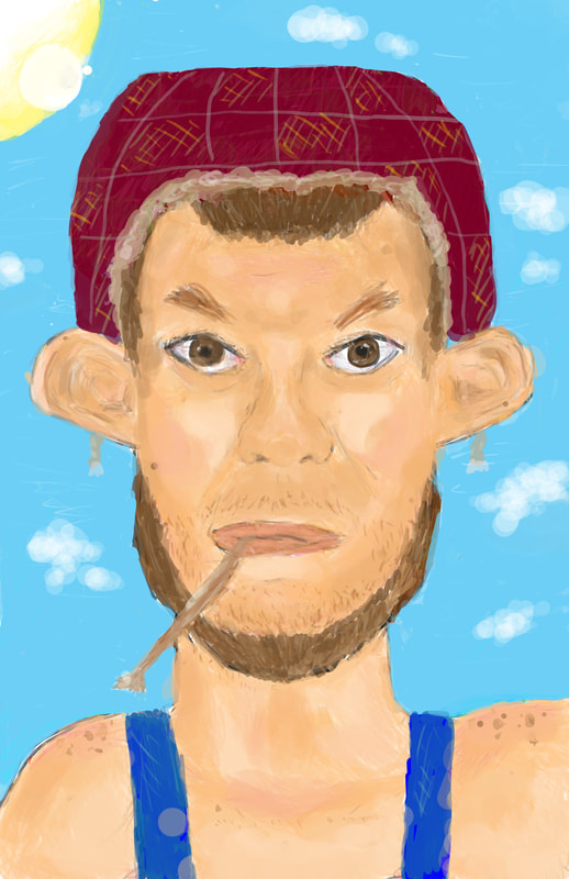 To start, I planned out my characters background and all of his characteristics, creating a mental picture of what I wanted him to look like in my head and on paper. I then began designing, using the symmetry tool to create a line of vertical symmetry through my template so I could begin sketching my character and maintain facial symmetry so my character does not look distorted and looks as realistic as possible. After creating my outline using small strokes, I began to fill my character in with color, using the paintbucket tool, to get the colors I wanted in place. After filling in the color, I decided to begin shading and creating depth. For this I increased my brush's diameter and created a shortcut for the blend/eyedropper tool. I then added in simple strokes and blended them in consecutively until the shading looked smooth and neat. After shading my character in, I added in a background using the same brush settings to easily create clouds and the sun. Eventually I began adding more details into my character, such as drawing in more discrete facial hairs and freckles to add more realism to my character. 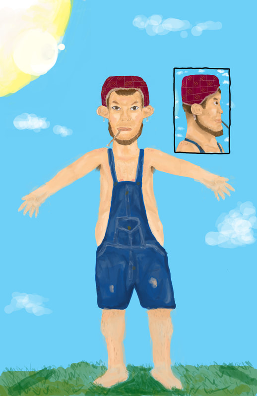 As seen in the image above I then worked on creating a full body and a preview for a side view. To create the side view I implemented the ruler tool on to my original front view and used the lines it created in a new layer to figure out the positions of all the facial features for my side-view. From there I used the same process as I did to create the front view. Finally, I began working on the body in the form of an A-Pose. I again used the same process for the skin tone, but the denim was tricky. First I used 'Place Embedded" to add in an image of denim. I then used the eyedropper tool to sample colors and the shading from that image and implemented it into my own, using that to create seams and folds in the jacket to create the texture. From there I was done and began touching up minor details. Overall I got some experience with the Wacom tablet, as well as learned some new tools and methods to help with shading and creating different views/angles of a person, as well as got to work with the process of character development and design. In a nutshell:
References: “Women Clothing Blue Jeans Denim Overalls.” Amazon, Amazon, www.amazon.com/Women-Clothing-Jeans-Denim-Overalls/dp/B071HVYCX9. “Wacom Intuos Pro: Creative Pen Tablet.” Wacom, www.wacom.com/en-gb/products/pen-tablets/wacom-intuos-pro. 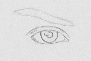 For this assignment I chose to revisit Adobe Photoshop and look more into the process of creating an image from scratch by colorizing, shading, and working with layer styles. I started by drawing a simple eye outline and photocopying it. This would be my template. I then used the brush and paint bucket tools to fill in basic areas and outline my pencil strokes. I then worked with detail in the iris by adding a bunch of fine strokes and then used the paint bucket around it to create a nice texture and color for the eye. I then drew veins in the eye and tried to make it look as realistic as possible. Next I added hairs into the eyebrow to give it texture and then to add to the background I drew in a nose and more skin textures/outlines. I then used the burn and dodge tools to help give the eye more dimension and shade in certain parts of the drawing to create realism. Finally, since it seemed a bit plain and lacking texture, I chose a layer style called Craquelure. Overall I am very pleased with my final product, though it did take a lot of time, patience, and detail! 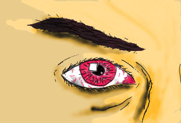 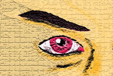 Final product! Summary:
References:
Throughout this year we have worked with animation, but never before in 3ds Max. I am experienced with animating 2D graphics in the Adobe programs, and I expected it to be harder to animate 3D models since there is an extra dimension to consider. However, 3ds Max makes it incredibly easy. All you have to do it set up your scene, select all, select a new keyframe, then reconfigure your scene, and so on. The program fills in the interpolations smoothly and rigging the animation is extremely easy. All you have to do is move a few things around and change up your objects however you want and that's basically all there is to it.
On the other hand, in the Adobe programs, there was a lot more to it. You had to insert clips, work with all these layer effects, and there were a lot more properties to consider if you wanted to give your animation cool effects. However, 3ds Max is a good 3D modeling program and has animation built into it; Adobe divided their apps into ones that work with creating the graphics and others used to animate. Since 3ds Max has all of it built it, the changes and effects are a lot easier to apply and you don't have to really import a bunch of stuff or do so much work with a timeline. It is very simple and is basically just reconfiguring your scene a couple of times to create your keyframes.
This is a scene I quickly animated.
Conclusion:
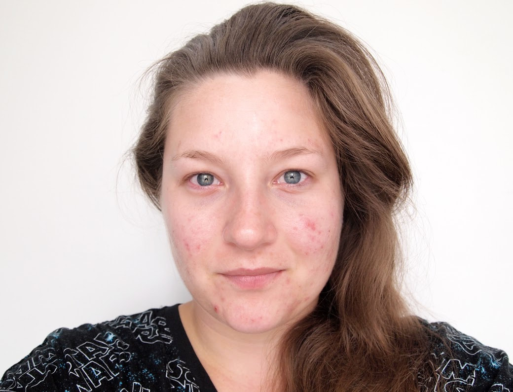 This is an image of a girl, before I touched it up with the spot healing brush. You can notice the stray hairs and her acne/pimples. While working with Photoshop and learning about the various tools, my favorite, and in my opinion, the most useful tool so far, has been the Spot Healing Brush. It is super easy and fun to use; you simply click or move the brush over a minor feature you do not like and it blends into the rest of the image. It's very satisfying and fun to watch these spots go at the click of a finger! It also has a remarkable impact. As discussed in my first blog post, taking away natural appearance, and creating idealistic images of people with no imperfections, can be very demoralizing to people who compare themselves with these images, and it lowers their self-esteem. However, there are times that the Spot Healing Brush can be important/beneficial in use, especially with skin blemishes. For example, you can pay to have your images in yearbooks retouched, where they take out pimples and acne, or other temporary facial blemishes. You could also wake up with a bad zit. When looking back, you wouldn't want to be distracted by those minor details, but instead see what you really looked like, besides for that day's blemishes. The Spot Healing Brush is particularly effective with blemishes and with the tap of a finger, can make it look like they were never there. This way you can see what you looked like underneath your imperfections. As said this can also be used in a harmful way, but overall it is a very useful tool in taking away blemishes, or minor details, and is very commonly used and is significant in how people view themselves. Overall it is my favorite tool because of its simplicity, but major use and impact. 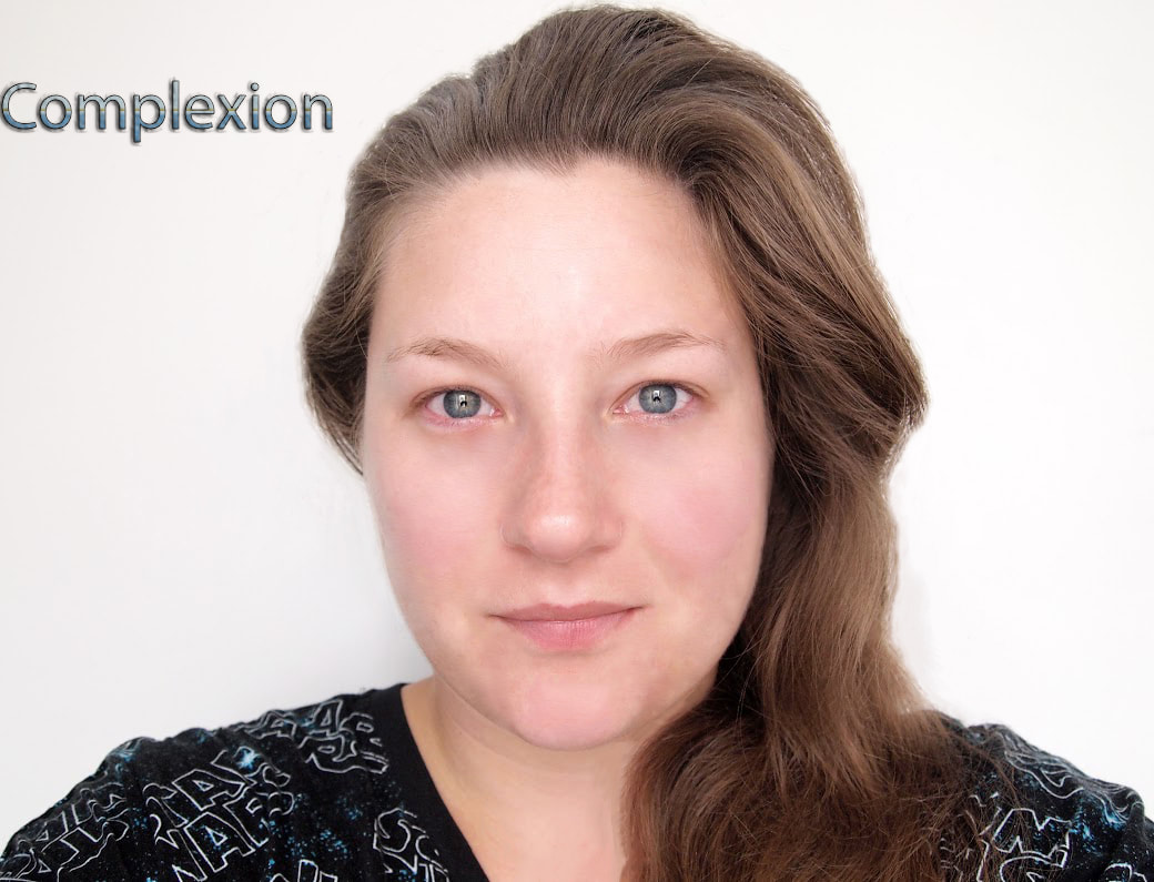 This is the image after I touched it up. You can see how clean her face is and how the stray hairs are gone. Conclusion:
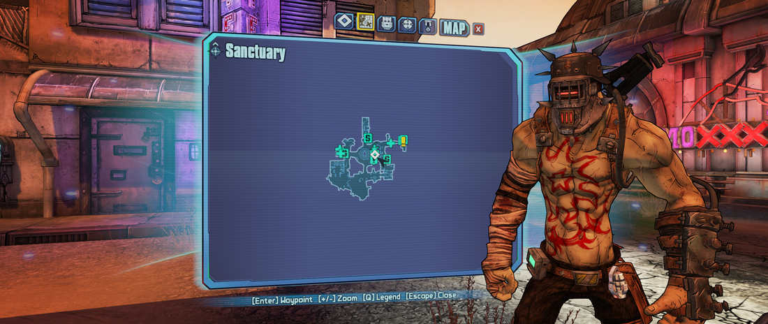
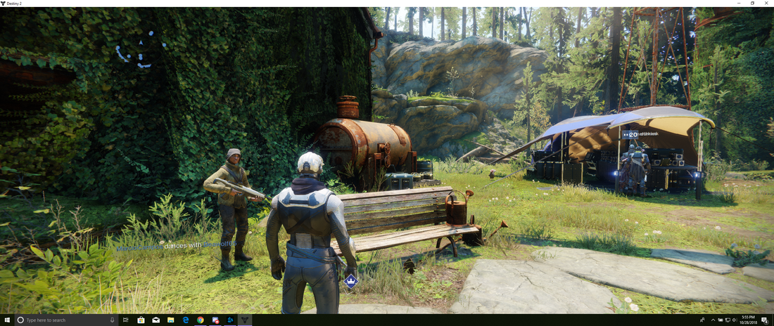
Every game puts a different emphasis on how it appears to its viewers. Some games, such as Destiny 2, stress on having a realistic appearance. Other games, such as Borderlands 2, take on a different sense; they don't focus as much on realistic appearances, but instead, go with a cartoon style to help emerge the player into an alternate universe. It is through the use of various elements and principles of design that help make a player feel like they're in a different world. While Destiny focuses on connecting players into a real world, Borderlands takes on a more impractical and surreal feel. Borderlands uses a style very similar to cell-shading by scanning concept art and then adding color and outlining certain parts. This simple use of lines to highlight the essential details is the key to bringing out a cartoony appearance. Destiny uses a realistic style and demonstrates a more complex understanding of the line principle; their lines are specific down to the detail. Both games use organic shapes to help bring a natural feel to the game; contrary to some other well-known games such as Minecraft and Roblox, which use geometric shapes. Destiny and Borderlands also use realistic color choices, however, Destiny's is more natural than Borderlands'. Borderlands uses dull and pastel colors in its landscape, however, it displays emphasis by using vibrant neon colors, seen on signs, to draw you in and create a more obnoxious feel. The difference in texture between the games is what really differentiates them. Borderlands has a less realistic feel and comes off as flat, mainly due to its lack of texture and use of simple lines. Destiny's intricate texture which is produced with their complex use of lines, makes it seem much more natural and realistic. Conclusion:
Citations:
“Borderlands (Video Game).” Wikipedia, Wikimedia Foundation, 17 Oct. 2018, en.wikipedia.org/wiki/Borderlands_(video_game). “Borderlands Explains Its 'Not Cel-Shaded Actually' Art Style.” Destructoid, www.destructoid.com/borderlands-explains-its-not-cel-shaded-actually-art-style-128892.phtml. “Borderlands 2 on Steam.” Welcome to Steam, store.steampowered.com/agecheck/app/49520/. “Get The Game.” Destiny the Game | Where To Buy, www.destinythegame.com/buy?utm_campaign=alwayson2018&utm_medium=search&utm_source=google&utm_term=destiny-2-Exact&gclid=EAIaIQobChMIr4i8xL2q3gIVEVYMCh10DAxZEAAYASAAEgLP6PD_BwE.
The use of color also allows us to notice and highlight more details. Color techniques such as balance, contrast, and rhythm can enhance the image and make a stronger impact on the viewer. The color palette can also give historical clues - the dull and drab tones of the ‘70s, the flashy neon of the ‘80s... Today’s world is immersed in color and older black-and-white movies don’t hold the appeal they once did. Colorizing them gives them a renewed life and carries the enjoyment into a new generation of viewers. I think programs such as Photoshop can be used in many different ways to enhance photos and videos. Colorizing old images gives us better insights into the past. Conclusion:
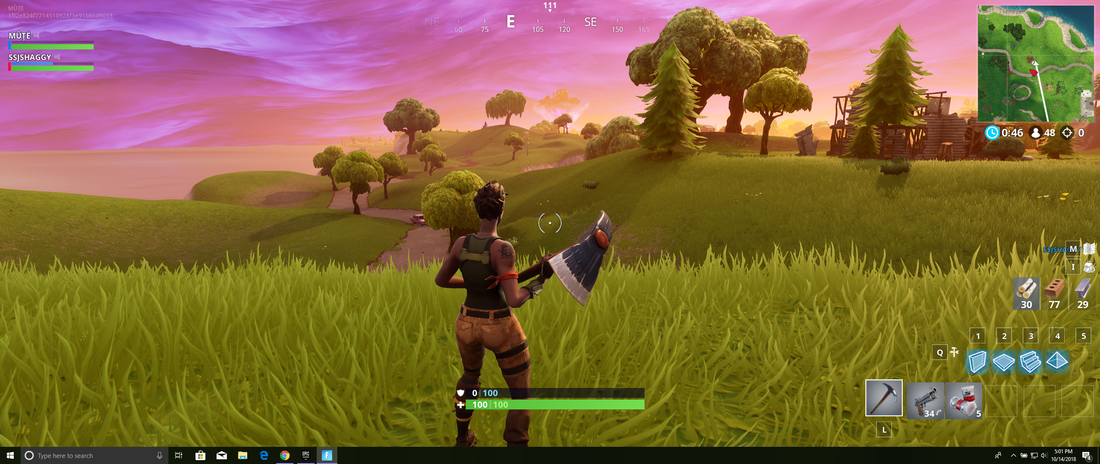 Fortnite is currently blowing up in the game industry and has become a household name, and to some extent, a lifestyle/cult for many kids. A big part of this is due to it's vibrant, cartoony, landscape, that looks like it has been excerpted directly from a 10-year-old kid's imagination. This helps engage and work as an escape for the players, and also helps mask Fortnite's dark story which can be unsettling and depressing. In creating this setting, the game designers were very clever in their style, and particularly their color choice. The Epic Games game designers used not only a cartoony style but picked vivid colors that give the players a sense of overall freedom and liveliness. Fortnite uses a vibrant color palette, dominated by bright tones of green, blue, purple, orange, pink, and yellow. These lively colors are one-touch off reality and bring a utopian tone to real life colors, creating a fantasy-like and only imaginable setting. They convey feelings of beauty, peace, stability, freedom, and liveliness that overall give an optimistic appeal. Fortnite's intentional use of color to influence the mood is also evident in the dark color palette used in the storm. The darker color scheme of grays, blues, and purples gives you a sense of danger and brings a feeling of insecurity, causing you to want to run out of it. Overall Fortnite's contradictory and whimsical setting allows you to escape from the mundane colors of your everyday world and submerge yourself into an engaging fantasy. 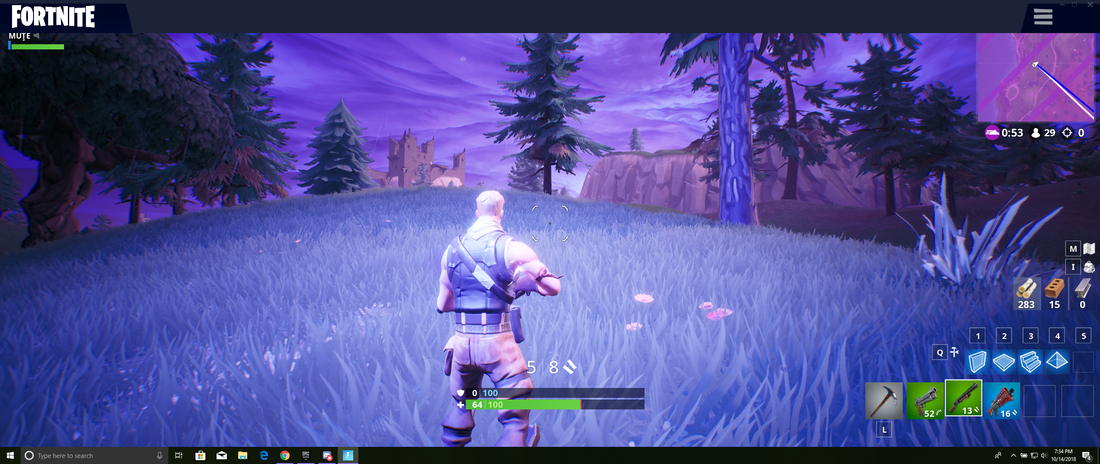 Summary:
|
AuthorMy name is Quinn Peterson! I will be reflecting about my art work in this blog! Archives
May 2022
Categories
All
|


 RSS Feed
